The new and updated features included in iOS 10 are plentiful, and Apple users and developers have already begun to voice their opinions of a number of them online. Many testers have come away impressed by new, personalized additions to old apps like Photos, the new raise-to-wake feature, and subtle but useful additions to Maps, which can now remember where you parked your car.
Of course, where there are positives, there are negatives as well, so we've gathered up user reactions on a few of the new features of iOS 10 and attempted to bring in variety of opinions on each where possible while gauging overall sentiment from early users.
Parked Car Notifications
Reaction: Largely Positive
A new feature in iOS this year will allow Apple Maps to remember where users park their cars, which should be helpful when parking in large structures and garages. One iOS 10 beta tester noted the feature popping up at their home (which should eventually be prevented once a home address is entered) with a notification on the iPhone's lock screen.

Nice touch Apple! Can see this being useful for festivals, shopping and more!
Once in the Maps app, a small Parked Car icon appears where you left your car, and a separate sheet can be filled out to add details like a photo of the car's location and even a text note to jot down a description of the area or level of the parking garage you were in. Some users call the new parked car notifications a "catch-up feature," since Android and apps like Waze have offered similar functions for the past few years, but otherwise the reaction is an encouragingly bright one.
Memories
Reaction: Positive
Apple focused significant attention on one new aspect of its Photos app during its WWDC keynote yesterday, and it's a tab called "Memories." With it, Photos will aggregate a user's photos and place them into smart folders, dynamically understanding where every photo was taken and which friends and family members were in each. With this, it should be easier to revisit old memories from trips and vacations, or just small get-togethers, instead of endlessly scrolling through the camera roll for a specific shot.
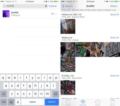
One Reddit user particularly liked the search functionality this enables in Photos, which generated reliably impressive results even for more obscure terms such as "Poodle" and "Graffiti," without requiring the user to tag or describe every single photo.
Other successful searches include "Palm tree", "Red wine", "Poodle", "Jacket", "Beer", "DJs", "Fire", "Serpent", "Hardhat", "Nest". Apple are managing some pretty amazing stuff without sacrificing user privacy. This is a feature I assumed I wouldn't be able to get unless I uploaded my photos to Google, which I didn't really want to do. This is now a very interesting development in the AI/Machine Learning space.
While the testing has shown some words yielding zero results for terms that should be discovered in a 15,000 photo strong library, search abilities will no doubt improve over time, and overall reactions to Memories are favorable. Siri also works with the feature, although it appears to be "buggy" for now.
Press Home to Open
Reaction: Mixed
One particularly interesting tidbit from iOS 10 that some might not know about is a completely new method required to get into your iPhone. "Slide to Unlock" is gone in Apple's newest operating system, with a dual "Press home to unlock" and "Press home to open" set of cues appearing at different times at the bottom of the lock screen. Swipes are now designated for accessing some richer front-end features of iOS, with a left swipe now taking you to the camera and a right swipe going to widgets.
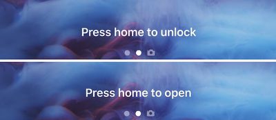
The new method of unlocking an iPhone is optimized with the new raise-to-wake feature of iOS 10 for the latest A9/M9-based devices, alongside the speed of Touch ID. When raised, the iPhone won't unlock until the user presses the Home button down and Touch ID confirms their fingerprint; without a valid fingerprint, the traditional passcode number pad will pop up. Most beta users appear to be largely in favor of this new unlocking method, describing raise-to-wake as a fluid feature that "senses movement extremely well."
Still, some users are not fans of the system. While one Redditor appreciated the potential for the Lock screen change-up, the added requirement of needing to press the Home button to use Touch ID (currently, if the iPhone is awake, Touch ID will work with no Home button press), left them to "completely loathe" the new method.
Love the raise to wake. Love the new camera swipe. Widgets are just clunky and not useful for me... Never really used them before, but maybe this will cause some more innovation in the widgets. I absolutely and completely loathe the "press home to unlock" thing. My absolute favorite thing about Touch ID was that I could just lay my finger on my home button and unlock it (if it were already awake). If this were combined with the raise to wake feature. I could effectively eliminate the need for my home button. That would be fantastic. I know it's a beta - and a developer beta at that - and I am just hoping that they will make it optional or improve it somehow. If not, I think I would be content on iOS 9 for a while longer.
Apple's new method gives more intuitive access to widgets and the camera while compensating for the previous unlocking method that left some users of Apple's latest notifications missing their notifications after Touch ID registered "too quickly."
Font Size
Reaction: Mostly Negative
A lot of the conversation surrounding iOS 10 in online forums focuses on a noticeable shift in notification font size changes. One Reddit user asked for everyone's opinion on the "massive" text found in notifications and apps like Apple Music. Positive opinions cite bolder and easier to read text, but a larger, negative group fears for information density being traded off for unnecessarily large fonts with no apparent way to opt out of such changes.
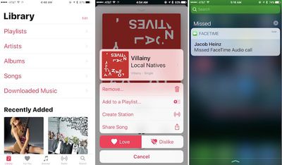
I understand this a change for the "better" since people with vision problems will have an easier time, but it does come at the price of disgusting people with good eyesight who would rather see more information at once. Hopefully iOS 11 will include a DPI switch like the one Android N is shipping with that will allow people to independently scale UI to make it bigger or smaller, this way everyone is happy.
Another Redditor remained concerned over the larger text font, describing a Playlist screen in Apple Music that only shows "4-5 Playlists" at once on their iPhone 6. Multiple users reference an overall feel to the new UI that reminds them of accessibility-enabled features that blow up text for vision-impaired individuals. Similar concerns were raised about the update to Apple News as well.
Sleep Analysis
Reaction: Negative
The introduction of a new "Bedtime" tab in Apple's Clock app also piqued interest when revealed briefly during WWDC this week. Unfortunately, in the hands of a few beta users, Bedtime's "Sleep Analysis" feature has proven less useful than many had hoped.
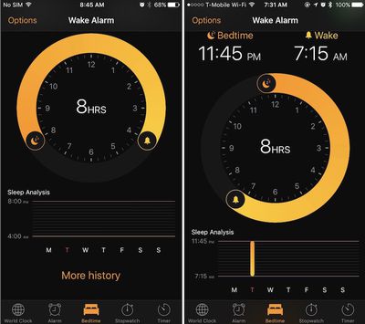
Last night, one Redditor tested out the new addition, hoping that the app might somehow access the iPhone's accelerometer and microphone to detect sleeping habits -- similar to some third-party apps -- but that didn't turn out to be the case. In the morning, the user called Sleep Analysis "totally pointless," explaining that the accompanying graph is essentially a visual guide for anyone who wants to keep track of the manually entered hours of sleeping and waking from the new Bedtime tab.
Yeah it's totally pointless. It doesn't detect when you sleep it's just an alarm which you can adjust the parameters in a nicer way. If you want to track sleep length you have to move the first dot every time to the current time when you go to bed. Utterly pointless.
Otherwise, changes to the Clock app including a new dark theme throughout the app have been well received. As a few users pointed out, the Bedtime tab is essentially a rebranded way to set a consistent alarm schedule, just with more flexibility for those with varying work schedules.
Tidbit Reactions
With so many new additions coming to iOS 10, there are many other opinions out there on dozens of other features making their debut in Apple's newest mobile operating system. We'll list a few other popular tidbit reactions below, but be sure to join in on the iOS 10 conversation in the MacRumors forums as well.
- Breadcrumb trail no longer replaces signal strength and Wi-Fi icon
- Split View on iPad
- "Unsubscribe" button in Mail
- Font of user initials in Messages


