At WWDC today, Apple revealed an all-new Apple Music redesign while also confirming that the service has officially reached 15 million paid subscribers. The redesign introduces a bright and simplistic aesthetic and a new "Library" launch tab on the bottom left.
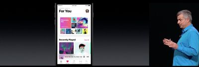
According to Apple, the new design language brings "greater clarity and simplicity to every aspect of the experience." The Library, For You, Browse and Radio tabs have gone through a design change that will give the user "an even greater sense of place."
The company has also begun to better differentiate streaming and downloaded songs in the new iOS 10 version of Apple Music, with a specifically designated "Downloaded Music" section located within the app. A few other minor additions include a new lyrics feature and revamped "For You" tab with daily curated playlists aimed at each Apple Music user.














Top Rated Comments
This looks pretty amazing, their pretty much addressing all that's wrong with the current UX. I do not fancy the font myself, but everything else looks like a huge improvement.
Other than that I hope it's better for local music.