Instagram has selected a group of users to test a version of its app with an overhauled design, which can be seen in a series of screenshots sent to MacRumors by reader Sebastien. Unlike the previous Instagram design, which utilizes a white feed bookended by blue and black borders and blue accents, the new design features a more monochromatic look.
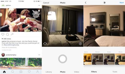
The new color scheme appears to be part of an effort to help photos, specifically color photos, pop more in a user's feed. The icons have also undergone design changes. The camera button on the bottom bar is no longer singled out with a blue box around it, and the camera button in camera mode is now a grey ring rather than a blue circle. The activity button on the bottom bar is a simple heart rather than a heart in a speech bubble and the profile button on the bottom is the outline of a person rather than a user's photo.
Instagram tells Mashable that the company often tests "new experiences with a small percentage of the global community" and that this test was "a design test only." It's unclear whether this design will become official in a future update or whether the company decides to not move forward with it.
More recently, Instagram has been making tweaks and changes to how its app works. Two weeks ago, the company added video channels to its "Explore" feature. Before that, it expanded video clips from 15 seconds to 60 seconds and announced that it would introduce an algorithm-based feed.
Instagram is available in the App Store for free. [Direct Link]










Top Rated Comments