Apple today updated the Developer Center portal designed for developers an interface redesign for the account page that makes it easier to access all of the different developer resources.
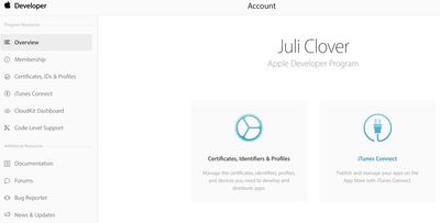
The new account page, which features a clean look with quick access to Certificates, Identifiers, & Profiles, and iTunes Connect, replaces the previous "Member Center" for developers. Along with front-and-center buttons for frequently used tools, there's a left-side navigation bar that makes it easy to access resources like CloudKit, documentation, forums, and the bug reporter.
Aside from the new account page, the rest of the Developer Center is unchanged, but it's possible the updated look will be extended to additional pages in the future.

















Top Rated Comments
I say: keep it!
Keeps expectations low → less disappointment when your tickets remain untouched for months.
Glassed Silver:mac