OS X El Capitan Review Roundup: Not Hugely Different From Yosemite, but Adds New Conveniences

At its Worldwide Developer's Conference last week, Apple introduced OS X 10.11 El Capitan, the newest version of its Mac-based operating system. At the time, Apple provided the software both to registered developers and to members of the media. Media reviews are hitting the web, giving us our first in-depth opinions on OS X El Capitan.

We've rounded up details from some of the best reviews in order to give MacRumors readers a look at OS X El Capitan from the perspective of people who have used it extensively over the course of the last week. Each of the reviews is worth reading in full to get a feel for how OS X El Capitan builds upon the features introduced with OS X Yosemite.

os_x_el_capitan_roundup
Lauren Goode, Re/code:

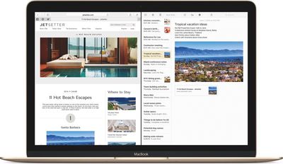
The most notable I've-seen-this-before feature in OS X El Capitan is Split View: Now, two apps can run in split view on a full screen. Finally! Mail and TweetDeck side by side throughout the day, on a full screen, without having to manually drag windows into place. Of course, Microsoft Windows has had this "snap" feature for years.

Jim Dalrymple, The Loop:

I use Mail a lot. Unfortunately, I've had some trouble lately with Mail on Yosemite getting stuck while checking IMAP connections, especially after I wake the computer from sleep. All I ask for in El Capitan is for that to be fixed.

elcapitansplitview
The good news is that it seems much better in this beta version of the operating system. Apple said Mail in El Capitan delivers an improved IMAP engine, so I'm very hopeful. I haven't had Mail stop working yet and I'm a week into using it--that's a damn good sign.

Lance Ulanoff, Mashable:

The differences between Apple OS X Yosemite and El Capitan are so subtle that it often feels like one of those puzzles where you have to spot 11 differences between two photos. Considering Yosemite was a lauded OS overhaul, this isn't a bad thing, but the best way to sum up Apple's OS update is this: If you like Yosemite, you'll like El Capitan, too. [...]

Apple tweaked system performance to improve mail load times and application launches, but it was hard for me to tell the difference. Did it seem fast? Yes. Does Yosemite also seem fast? Yes. I did notice one very beta glitch when I unexpected ran out of system memory in El Capitan.

Darrell Etherington, TechCrunch:

Now, Apple has added a lot of muscle to Notes in 10.11, turning into a much better competitor not only for other text editors, but for things like Evernote, too. You can integrate images, PDFs, videos and other media right into notes via drag-and-drop insertion, for instance, and crate checklists out of line-separated items with a single click.

Formatting ensures that you can create headers, paragraph styles, bold and italicize text and you can attach from your Photos app directly. Open content from other apps directly in Notes, too, using the Share menu across OS X, and even add stuff like Maps locations, spreadsheets and more. Folders keep things more organized, and thumbnails provide easy identification of what's within a Note from the sidebar menu when you're including media.

Dieter Bohn, The Verge:

Why would you choose Apple's solutions in El Capitan? Because they're all so tightly integrated. Maps talks to Notes, Calendar talks to Mail, and all of them talk to Spotlight. All of those interconnections and digital conversations could subtly drive you to opt for Apple apps instead of whatever you might have been using before. Think of it like Continuity, but inside the computer instead of between devices. And all of it works incredibly well.

Dana Wollman, Engadget:

Some of my favorite updates are in Safari, though many would rightfully argue that these improvements aren't necessarily novel. In fact, some appear to take after features already offered in Chrome, and other competing browsers. For instance, there's now an option to identify which tab is playing sound. From there, you can hit a mute button on the tab itself, or click the speaker icon in the address bar. The latter option comes in handy when you have sound coming from multiple tabs -- say, a song you meant to stream, and an auto-playing video ad in the other. By clicking the sound icon in the URL bar, you can see a list of all the tabs playing sound and selectively mute the one that's bothering you.

elcapitanpinnedsites
Perhaps my favorite new feature is the addition of pinned sites. They sort of form a bookmarks bar, only better: Here, these tabs can't be closed, and because they look like shrunken buttons, they take up much less space than a regular tab.

Rene Ritchie, iMore:

Thanks to a new CoreSpotlight API, developers can now make the content in their apps, including documents, messages, and more, available to Spotlight as well. That means it'll be even easier to find what we're looking for, no matter where it's contained.

I've tried LaunchBar, Alfred, and Quicksilver, but none of them ever stuck: Spotlight has always been my go-to. Yosemite made it significantly more functional, but natural language and the new results engine promises to make it integral to the Mac experience. I'm really looking forward to using it full-time come the fall.

Other Reviews:
Ryan Smith, AnandTech
David Pierce, Wired
Ed Baig, USA Today
David Pogue, Yahoo
Andrew Cunningham, Ars Technica

OS X El Capitan is currently only available to registered developers. Apple has plans to introduce a public beta test of the software in July, following that with a fall public release. For detailed information on all of the new features in OS X El Capitan, make sure to check out our El Capitan roundup.

Related Forum: OS X El Capitan

Popular Stories

iPhone 17 Pro in Hand Feature Lowgo

iPhone 17 Pro to Reverse iPhone X Design Decision

Monday July 7, 2025 9:46 am PDT by
Since the iPhone X in 2017, all of Apple's highest-end iPhone models have featured either stainless steel or titanium frames, but it has now been rumored that this design decision will be coming to an end with the iPhone 17 Pro models later this year. In a post on Chinese social media platform Weibo today, the account Instant Digital said that the iPhone 17 Pro models will have an aluminum...
iphone 16 pro models 1

Here's How the iPhone 17 Pro Max Will Compare to the iPhone 17 Pro

Saturday July 5, 2025 1:00 pm PDT by
Apple should unveil the iPhone 17 series in September, and there might be one bigger difference between the Pro and Pro Max models this year. As always, the Pro Max model will be larger than the Pro model:iPhone 17 Pro: 6.3-inch display iPhone 17 Pro Max: 6.9-inch displayGiven the Pro Max is physically larger than the Pro, it has more internal space, allowing for a larger battery and...
iOS 26 Feature

Everything New in iOS 26 Beta 3

Monday July 7, 2025 1:20 pm PDT by
Apple is continuing to refine and update iOS 26, and beta three features smaller changes than we saw in beta 2, plus further tweaks to the Liquid Glass design. Apple is gearing up for the next phase of beta testing, and the company has promised that a public beta is set to come out in July. Transparency In some apps like Apple Music, Podcasts, and the App Store, Apple has toned down the...
imac video apple feature

Apple Launching These 15+ Products Later This Year

Sunday July 6, 2025 8:05 am PDT by
The calendar has turned to July, meaning that 2025 is now more than half over. And while the summer months are often quiet for Apple, the company still has more than a dozen products coming later this year, according to rumors. Below, we have outlined at least 15 new Apple products that are expected to launch later this year, along with key rumored features for each. iPhone 17 Series iPho...
iPhone Car Key Kia

Here's Which Vehicles Offer iPhone Car Keys

Sunday July 6, 2025 3:03 pm PDT by
In 2020, Apple added a digital car key feature to its Wallet app, allowing users to lock, unlock, and start a compatible vehicle with an iPhone or Apple Watch. The feature is currently offered by select automakers, including Audi, BMW, Hyundai, Kia, Genesis, Mercedes-Benz, Volvo, and a handful of others, and it is set to expand further. Apple has a web page with a list of vehicle models that ...
iPhone 17 Pro in Hand Feature Lowgo

iPhone 17 Pro Coming Soon With These 14 New Features

Friday July 4, 2025 1:05 pm PDT by
Apple's next-generation iPhone 17 Pro and iPhone 17 Pro Max are just over two months away, and there are plenty of rumors about the devices. Below, we recap key changes rumored for the iPhone 17 Pro models. Latest Rumors These rumors surfaced in June and July:Apple logo repositioned: Apple's logo may have a lower position on the back of the iPhone 17 Pro models, compared to previous...
iphone 17 pro render majin bu

New iPhone 17 Pro Renders Highlight Apple Logo and MagSafe Design Changes

Sunday July 6, 2025 8:43 pm PDT by
New renders today provide the best look yet relocated Apple logo and redesigned MagSafe magnet array of the iPhone 17 Pro and iPhone 17 Pro Max. Image via Majin Bu. Several of the design changes coming to the iPhone 17 Pro model have been rumored for some time, such as the elongated camera bump that spans the full width of the device, with the LiDAR Scanner and flash moving to the right side. ...
iPhone 14 Pro Dynamic Island

iPhone 17 Models Rumored to Feature Redesigned Dynamic Island

Monday July 7, 2025 7:38 am PDT by
iPhone 17 models will feature a redesigned Dynamic Island user interface, according to a post today from Digital Chat Station, an account with more than three million followers on Chinese social media platform Weibo. The account has accurately leaked some information regarding future Apple products in the past. The account did not share any specific details about the alleged changes that are ...
apple account card feature

Apple Account Card Expanding to More Countries

Tuesday July 8, 2025 7:34 pm PDT by
Apple is expanding the ability to add an Apple Account Card to the Wallet app to more countries, according to backend Apple Pay changes. With iOS 15.5, Apple updated the Wallet app to allow users to add an Apple Account Card, which displays the Apple credit balance associated with an Apple ID. If you receive an Apple gift card, for example, it is added to an Apple Account that is also...

Top Rated Comments

RoelJuun Avatar
131 months ago
A shame Ars Technica's John Siracusa won't be writing a 20+ page review anymore…The one and only true review.
Score: 17 Votes (Like | Disagree)
taedouni Avatar
131 months ago
How sad...Beta 1 for developers (not even an actual beta for beta testers) deserves a review by the media?
Poor Apple.

Edit: Actually, the article on Macrumors is misleading. I clicked on 4-5 of the articles and they all said either Preview or First Look (not review). Bad Macrumors.
Score: 10 Votes (Like | Disagree)
dannyyankou Avatar
131 months ago
My favorite new "feature" is performance. Beta 1 is much more zippy than the latest public build of Yosemite.
Score: 9 Votes (Like | Disagree)
wwooden Avatar
131 months ago
Can anyone explain the reason/logic for not adding Siri to the desktop OS? I'm not trying to be a dick, I really am curious. When I watched the keynote and they showed the new features to spotlight, it just screamed to me to be replaced by siri. I feel like Siri would actually be more natural to use on a desktop: usually in a quiet and private office, wouldn't feel as "weird" to talk to my computing device.
Score: 9 Votes (Like | Disagree)
RedBear Avatar
131 months ago
Not too many people seem to have noticed that something rather momentous just happened with El Capitan. For the first time ever in the history of Mac OS (as far as I know), there is an official option to automatically hide and show the menu bar, just like you can auto-hide the Dock. Look in System Preferences -> General. This option is definitely not present in Yosemite and is something I tried to do in various ways for several years after switching to OS X from a combination of Windows and Linux over a decade ago. There was an Unsanity APE haxie years ago called Menufela that was able to hide the menu bar, but it stopped working around the time Tiger came out. I had given up on ever achieving my dreams of minimizing unnecessary stuff being shown on my screen in OS X, but now it is possible. I even tried something called MenuShade for a while, that would overlay a black bar on the menu bar to "hide" it, but after a while that seemed sort of pointless.

I can now hide both the menu bar and the Dock and stretch my windows (if I so choose) to fill all available physical screen space. The menu bar and Dock will pop up and overlap the window, then disappear. This is fabulous on a small screen, but very nice even on a 17" MacBook Pro screen or a 27" iMac. You might think, oh, just go fullscreen, but you'd be missing the point. Fullscreen apps outside of the tablet/smartphone context are mostly a joke to me, because there is a only a single app (Screen Sharing) that I ever really want to use on the screen all by itself. It's a bad paradigm for most apps, as evidenced by the fact that Apple are now shoehorning a tabbed multi-window interface back into the fullscreen mode of Apple Mail, because obviously people found a single overlayed compose window in fullscreen Mail to be too constricting in practical usage. Fullscreen on the desktop is pointless except for things like gaming or Screen Sharing where you really only want to see that one task on screen without any distractions. Even a split-screen view with two fullscreen apps is just not that great. It forces you into a completely different way of interacting with the windows on the screen.

I frequently just want to work with a single window or a couple of different windows in different apps at the same time, but minimize visual distractions on the screen without necessarily filling the screen with the app window. To help me with that, I have an app called Isolator that will overlay any color you choose at any opacity level on everything behind the application that's in focus. It's pretty old but still works with Mavericks, Yosemite and El Capitan. Just google "download isolator willmore" to find it. The remaining thing that helps me size windows the way I want is the SizeWell SIMBL plugin, which amazingly still works with Mavericks, Yosemite and El Capitan also.

But really the final piece of the puzzle was being able to hide the menu bar, and now that is possible without any hacks. These tools, plus the four-finger swipe up and down on the trackpad for Exposé functions, are transforming the way I'm using my MacBook Pro, and this is a computer I've been using daily for several years, so that's really saying something.

From my personal perspective, the ability to auto-hide the menu bar is one of the defining features of El Capitan, and it was never even demonstrated or mentioned anywhere. I ended up stumbling upon it accidentally while trying to remember where to set "Reduce Transparency". It was like opening my sock drawer one sleepy morning and suddenly finding that while I was sleeping someone had lined it with 24 karat gold foil and filled it with live puppies, kittens, unicorns and rainbows, and at the end of the rainbows was a magical pot containing not just solid gold coins but also an endless supply of chocolate-chip cookies and chewy fudge brownies.

But that's just me. Apparently nobody else finds the sudden appearance of this long sought-after option to be a big deal.
Score: 9 Votes (Like | Disagree)
JonneyGee Avatar
131 months ago
There's nothing wrong with Apple taking a "Snow Leopard 2" approach. It's nice to see a few valuable features added but most of the time spent on refining things and making the system operate smoothly. I'm sure they'll iron out the kinks as beta testing rolls on throughout the summer.
Score: 7 Votes (Like | Disagree)