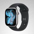
Apple's upcoming wearable, the Apple Watch, takes advantage of a unique interface that arranges apps with circular icons in a cluster-based design for quick and easy access with the device's included Digital Crown, or scroll wheel.
YouTuber Lucas Menge has created a mockup of what the Apple Watch interface might look like when translated to a larger device, like the iPhone. As with the Apple Watch, Menge's concept lets users zoom in and out on the app landscape, viewing one small cluster of apps or all the apps installed on the device.
The interface incorporates app names, which deviates from the design on the Apple Watch, and simple swipes allow users to scroll through the apps installed on the phone. Tapping when zoomed out will zoom into the area that's been tapped, and when zoomed in, a tap on an icon launches an app.
Menge, whose design was inspired by a mockup post created by 9to5Mac's Michael Steeber, has published his prototype code for the design on GitHub. Apple Watch, with its unique Watch OS operating system, will be available beginning in early 2015.












Top Rated Comments
I disagree. With this, you can potentially lay out your apps in a more irregular shape, which takes much better advantage of your evolved ability to memorise the layouts of natural landscapes. Grids are for computers, not human minds. I bet tests would show users able to find their apps far quicker in this layout.
hmm? the whole point of digital crown was to not obstruct the screen when zooming. the phone has plenty of screen estate, so it should be fine.