Apple late yesterday rolled out its overhauled iTunes Connect web portal with a new visual design and improved features to help developers manage the sales and marketing of their apps, books and other media. Apple first introduced the new iTunes Connect at WWDC 2014 and is rolling out the interface ahead of the expected fall launch of iOS 8.
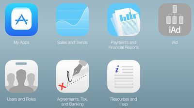
The web-based tool has an iOS 7-inspired flat design that is similar to iCloud.com and brings the site in line with the iTunes Connect iOS app [Direct Link], which was updated earlier this year.
Besides visual changes, the latest version of the web portal also includes an improved My Apps management section and a "Resources and Help" tab for troubleshooting media distribution and payment issues. The "Users and Roles" section also was updated to make it easier to manage both iTunes Connect and Sandbox users. Developers and other media producers can check out the changes at the iTunes Connect website.















Top Rated Comments
The iAd one is pretty bad, especially with the text in it.
Maybe they haven't rolled out updates for every section, or maybe it's overloaded with users checking out the new look. Regardless, I'm a little bummed.