Amidst the flurry of iPhone 6 rumors coming from KGI Securities' report last week, Ming-Chi Kuo presented the first possible screen resolution for Apple's 4.7" iPhone 6. Kuo lists it as a 1334x750 Retina display with a pixel density of 326 pixels per inch.
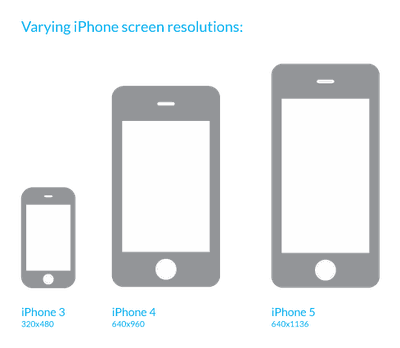
Historically, Apple has been very cautious with resolution changes in their iOS devices. The original iPhone was launched with a 320x480 resolution. Eventually, Apple moved to 640x960 Retina display, doubling the linear resolution in each dimension. That allowed existing apps to simply be pixel-doubled to fill the entire screen. Developers could then take their time to update their apps to fully support the higher resolution display. When Apple moved from 3.5" to 4" screens in the iPhone 5, they simply added vertical resolution. This allowed existing apps to run in a letterboxed format with black bars at the top and bottom of the screen.
Right before the 4" iPhone releases, Apple began encouraging developers to use AutoLayout in designing their apps:
Auto Layout is a system that lets you lay out your app’s user interface by creating a mathematical description of the relationships between the elements. You define these relationships in terms of constraints either on individual elements, or between sets of elements. Using Auto Layout, you can create a dynamic and versatile interface that responds appropriately to changes in screen size, device orientation, and localization.
AutoLayout paves the way for apps to more easily adapt to changes in display sizes and resolution in the future.
If Apple were to adopt a 1334x750 4.7" display as predicted by Kuo, it would preserve the same pixel density (326 ppi) as the iPhone 5s. That means that all existing user interface elements, such as icons, would be the same size but would allow for more screen space.
Our designer found that using the exact same icons and spacing them out to fill the screen, 1334x750 pixels allows Apple to fit exactly one extra row of icons onto the iPhone home screen. This mockup shows the relative size of the 4.7" iPhone screen and how much extra room there would be using the exact same icons as on the current iPhone:
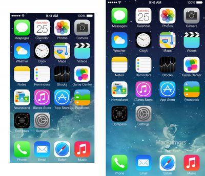 4" home screen (left) vs 4.7" home screen (right)
Meanwhile, existing unoptimized apps could function in a "letterbox" style with black borders for unused screen space. TheVerge forum user Pi is exactly 3 created a mockup showing this exact scenario. This image shows how an "unoptimized" app would appear (left) compared to one that has been optimized for the 4.7" display (right):
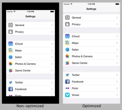 Mockup by Pi is exactly 3
Given Apple's past reluctance to blur or break existing apps, it seems that this resolution choice could provide Apple and developers a reasonable upgrade path for a larger factor iPhone. Apple has acknowledged that customers want larger iPhones and all iPhone 6 rumors are pointing to a larger iPhone device this year.


