Streaming music service Spotify today updated its app for iOS, bringing a major user interface redesign that emphasizes album arts with a darker theme, along with the addition of newer fonts and icons. The app’s new look is meant be in line with the design of the desktop and web versions of Spotify, which marks the first time the service has seen a visual overhaul since it first launched in 2008.
Speaking to The Next Web, Spotify’s Director of Product Development Michelle Kadir said the following about the service’s new look on iOS and other platforms:
We thought it was time for us to make a change… What we felt the past year is that we’ve kept innovating — we’ve shipped a lot of new features, we’ve launched in new markets, and we’ve also shipped on many new platforms. But what we haven’t done is to take a step back and just redo the design so that we feel like it’s new, it’s fresh — but also so that it really works across all platforms.
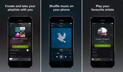
In addition to an overhauled user interface, the app also now includes a revamped Playlists section that allows users to save and organize music in a variety of ways, along with an updated Browse feature that contains enhanced smart playlist functionality and improved context-aware suggestions.
Spotify launched its free streaming tier for iOS devices last December, and integrated its Browse playlist curation feature last August as it has attempted to keep up with the likes of rival music streaming services such as Pandora and iTunes Radio. A report from Edison Research last month noted that Spotify was the fourth most popular service in the United States, making up for 6% of all listeners behind Pandora, iHeartRadio, and iTunes Radio.
Spotify is a free download for iOS devices and can be downloaded through App Store. [Direct Link]












Top Rated Comments
I'm going to assume this is a terrible attempt at sarcasm
They both do very different things. That may change in iOS 8 though.
two completely different services. iTunes Radio never ever plays what I want while i got the whole music catalogue at my disposal with Spotify.
---
and yeo that Shuffle button is horrible, especially in german. the writing barely fits inside
Did a double take. Glanced at the user name. Had guessed correctly. ;)