Steve Jobs' great displeasure about the the idea of a multi-button mouse was apparently the driving force behind Apple's push to greatly innovate in the area of input devices, according to a new interview with Apple's former Senior Mechanical Engineer of Product Design Abraham Farag (via Cult of Mac).
Farag, who is the current owner of product development firm Sparkfactor Design, says that he was brought onboard to Apple in 1999 to design a successor to the original Apple USB "hockey puck" mouse, which shipped with the iMac G3 in 1998 and garnered heavy criticism for its small size, short cord, and tendency to rotate in a user's hand.
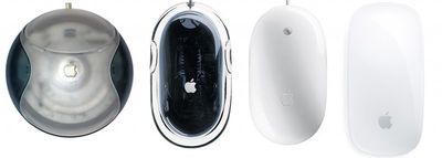
The designer said that Apple's design team had worked on five complete prototypes to show Jobs, complete with lines cut for buttons and different plastic parts. Farag noted that the team made a last-minute choice to work on one more prototype model, which resembled the Apple Desktop Bus Mouse II.
However, that last prototype was not finished as Jobs entered the room to look at the group of potential mice, which led to an encounter between the CEO and the design team:
“It looked like a grey blob,” Farag says. “We were going to put that model into a box so people wouldn’t see it.” However, when Jobs turned up things went awry.
“Steve looked at the lineup of potential forms and made straight for the unfinished one,” Farag says.
“That’s genius,” he said. “We don’t want to have any buttons.”
“That’s right, Steve,” someone else piped up. “No buttons at all.”
The meeting, it seemed, was over.“[Afterwards], Bart Andre, Brian Huppi and I left the room and huddled outside with each other, [saying] ‘how are we going to do that?’” Farag recalls. “Because of that unfinished model we had to invent a way to make a mouse with no buttons.”
The unfinished model that Jobs designated as his choice eventually became the Apple Pro Mouse, and began shipping in 2000. Farag believed Apple was the first to create a mouse that used an LED for optical tracking in place of a rubber ball, as the team looked toward building a successor worthy of the Apple Pro Mouse. Once again, Apple's design team wanted to create a mouse with multiple buttons, as Farag recalled a meeting with Apple design chief Jony Ive in which multiple prototypes were being discussed.
“Steve wasn’t invited to the meeting,” Farag recalls. “Not because he wasn’t allowed — he could go anywhere in the company — but just because it wasn’t something we were pitching to him yet.
...Suddenly Jobs happened to walk by, on his way back from another meeting. Seeing prototypes on the table, he stopped and came over.
“What morons have you working on this project?” he asked as he realized what he was looking at.“There was just a total hush,” Farag recalls. “No one was going to fess up to being the moron in the room. Eventually I said, ‘Well, this was asked for by the marketing division. It’s a multi-button mouse. It’s been approved through Apple’s process channels, and so we’ve been working on it.”
Jobs stared at him.
“I’m Marketing,” he said. “It’s a marketing team of one. And we’re not doing that product.” With that, he turned and stalked off.
Farag notes that it was Jobs' persistence to create a mouse unlike anything on the market that helped Apple in the long run, and that the concept of built-in capacitive sensors to emulate the presence of multiple buttons eventually changed the former CEO's mind about multi-function mice.
Apple then went on to produce the Mighty Mouse, which was the company's first mouse to ditch the one-button philosophy, and followed it up with the Magic Mouse, which features multi-touch gesture controls and is currently included with every new iMac.












Top Rated Comments
There is a significant difference: on OS X, you don't have to. You are absolutely not forced to use the second button. It is an Apple UI guideline that no commands should be in the contextual menu that are not available somewhere else. The Mac has always been designed to be approachable by anyone. That means, if you have never used a mouse before, you don't have to think about main- or secondary-clicking, what each means and why, or aiming with a weaker finger. You point. You click. You start with the simplest methods - click once, click a menu in the menubar, click a command. When you get proficient, you can do fancier stuff. Action menus in the Finder window. Trackpad multi-touch gestures. It's the entire reason the menubar still exists. I'm sure Adobe could come up with a way of using Photoshop that required no menubar at all, á la X Window. Why don't they? Because that menubar is the foundation of the Mac UI, and has been from the very beginning. And the mouse is designed to accompany it. (I recall the outcry when the original proposal was to place the Apple symbol in the middle of the menubar (http://www.guidebookgallery.org/pics/gui/desktop/firstrun/macosxdp4.png), symbolically shining over all on the screen - they were forced to put it back on the left and give it a purpose.) How many commands on Windows can you not do without a secondary-click? A bunch of the desktop organisational ones for starters. Does your grandma know how to clean up her desktop?
And yes, I realise in this day and age, people who have never used a mouse before a thin on the ground (although the number is probably on the upturn with iPads and other touchable interfaces).
Whether you agree or not, that's why it is the way it is. Which is not the same as Windows. Secondary-clicking is an option for Mac (among several). It's required on Windows.
On the other hand our friends at Apple have seriously nailed the trackpad (all laptops+magic trackpad).
Big in size. No need to physically click when using 'Tab to click'. Multitouch. And that oh so perfect surface.
It is trackpad heaven.
Both windows and OSX use the right mouse button click to bring up a contextual menu. Its silly to only have a one button mouse which forces the second button to the keyboard only.