A concept video of what a unified Control Center and multitasking interface would look like in iOS 8 has been created by designer Bill Labus and posted by TheTechBlock (via Cult of Mac).
The version of iOS 8 in the video shows the app switcher and user settings in one unified view accessed by a single swipe up gesture. Users are free to multitask or toggle preferences such as music volume and WiFi, as the buttons for the toggles themselves have been combined into one space to allow for more room. The video also shows a refined Notification Center that features a minimalistic look with more centered text, which is triggered by a swipe gesture down.
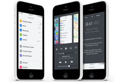
Labus also noted his reasons for making such changes to integrate the multitasking switcher into Control Center:
Unfortunately, I find double-clicking the home button to be irritating- there's a noticeable delay between the second click and the multitasking view appearing, and in my haste I often accidentally triple-click the home button, forcing me to wait while the OS bounces into, and back out of, multitasking. Control Center's bottom edge gesture is far faster and easier to perform, however as I said I do use Control Center frequently as well, so I wouldn't necessarily want to swap the two and use the home button double click to bring up Control Center.
Apple introduced Control Center and a refined version of multitasking with the release of iOS 7 last fall. While an overhaul or unification of both is unlikely to happen with any immediate update to iOS 7, it is possible that Apple could make major changes in time for iOS 8, which will likely be released this fall.















Top Rated Comments
I really do appreciate some of the care that went into the UI concept, though. And they even made the home screen icons look decent.
I'm less happy with the multitasking panel. You end up seeing the earliest notifications first, which means you can't just peek at it.
While they're at it, they could reverse the direction in which the multitasking panels appear. The apps I opened longest ago should be towards the far-left end of the list (in locales with a left-to-right writing system). I always double-take when I open that screen; it feels like I'm reading book where the pages turn the wrong way.
The same is true of the lock-screen. This is an artefact of the pre-iOS 7 days, when there was a slider to drag along a track. Now that you directly move the lockscreen itself, it feels weird to drag the screen from left to right in order to go "forwards".
Well, they are not stupid. Its how software designers look for a job. Apple is constantly checking the internet for ideas coming from the Apple community. Its not like Apple designers are cut off from every type of communication with the outside world. If Apple likes some of the concept images, they will contact the creator and offer him a job. Its a way for the designer to show his portfolio to the world.
I like concept images made by the community, even if they dont show in any way what Apple is planning. However, they are good example of what we can achive with the current technology and how the things can get improved.
If iOS had the option of user-installed launchers like Android, we probably would have, too. :rolleyes:
I generally love Apple's esthetics, but the functionality and even the UI of iOS are a bit stale in a few areas. And the keyboards suck, too. :p