United Airlines has launched a redesigned app for iOS 7, with features focused on delivering glanceable information and easier access to flight-related details. The new app now includes travel cards, which are shortcuts appearing on the app's home screen that automatically update with information such as departure times and reservations. Travel cards also include scannable codes for flights, allowing a user to present the code on their phone as a mobile boarding pass.
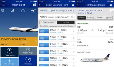
The new app for iOS includes current features our customers love as well as several new functions presented in a clear, touch-friendly, personalized design. The new easy-to-use home screen, travel cards and travel wallet add convenience right from the beginning of your travel experience. The organized look and larger graphics help you manage your travel with just one touch, and you can book fights and get information about your flight using the app’s personalized features.
Also included in the app is a new booking feature that allows users to make multi-segment bookings, an updated flight status view that includes details about flight times, seat maps, standby, and upgrades, and a travel wallet that holds information about boarding passes, reservations, flight notifications, and United Club memberships in one place.
United Airlines is a free app for iOS devices and can be downloaded through the App Store. [Direct Link]















Top Rated Comments
I'm not sure that your one experience is indicative of the airline as a whole and, for someone that has flown a lot, I have my fair share of horror stories for each airline but what exactly does that have to do with the app?
Interesting to compare the Delta App with the United one. Delta could do well to add the live update feature to the Passbook card to reflect gate changes etc in realtime, like the United one.
I used their app to load the checked-in tickets into Passbook. The morning of the flight, my lock screen included the airline tickets on-screen. I could swipe on them to bring the tickets up, and could easily swipe between my and my wife's tickets. This made it easy to bring the tickets up for scanning at the airport (TSA security point and the airline gate). We had a connector, and upon getting out of "airplane mode" the phone automatically cycled to having the connector's tickets on the lock screen. When I landed at my destination, the tickets disappeared from the lock screen. All four tickets were still available inside of the Passbook application, if I really wanted to see them. The return flights home provided the same experience.
It's much more convenient than having to unlock the phone, find the app, and then fumble with it to pull up the boarding pass.
United was smart to leave in all the good stuff that came from the Continental app. In fact, most of what makes United a somewhat decent airline today is a hold over from Continental (i.e. showers in the clubs in Houston. Nothing is better than a hot shower after a red-eye).
Yeah, the old app was clunky but quite powerful this one has the potential to be even better.
I hope they kept the "where is this plane coming from" feature in flight status as it has helped me predict when flights are going to be late even though they still claim to be "on time".
B