Facebook is preparing significant updates for its primary iOS app and its Facebook Messenger app in the near future, reports 9to5Mac. The main Facebook for iOS app will reportedly feature the social network's "Graph Search" feature, which was introduced last year and allows for users to enter specific search queries for better results. Meanwhile, an updated Facebook Messenger app is set to feature iOS contacts integration and sport a look with heavy white space similar to the design aesthetic of iOS 7, with another version similar in looks to the Messages app on iOS also being tested.
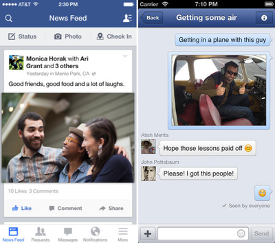
The report also states that Greg Novick, who was part of a group of Apple engineers hired by Facebook last year during a recruiting drive to work on its iOS app, has been rehired by Apple for an unstated role. Novick had previously been the Engineering Manager of iPhone Applications and Frameworks at Apple, and was a designer of the software that appeared on the original iPhone.
Both Facebook and Facebook Messenger are free universal apps for iOS devices and can be downloaded through the following links:
- Facebook [Direct Link]
- Facebook Messenger [Direct Link]




















Top Rated Comments
I don't understand the drive to make every app look exactly like Apple's own apps. So now FB Messenger is going to have tiny, unrecognizable discs for avatars and stretchy, flat message bubbles that fade as you scroll? Seriously? Why??
iOS 7's UI is really a giant step backwards in terms of "at a glance" usability, in my opinion. Hate to see more apps heading in that direction.
isn't it linked to the OS? how could they come up with something that runs on ios 7 but not on iphone 4?
----------
for the sake of my sanity. PLEASE PLEASE PLEASE make 'most recent' actually be the most recent AND let me keep that selection instead of defaulting back to 'news feed' EVERY TIME!!!!!!!!!!!!!
Not really. Not yet anyway (though I couldn't care less about the graph feature). When the iPad/iPhone experience at least mimics the desktop experience, then they'll have done enough. For example: why is it that my only choices to handle my comments when accessing FB on my iPad are copy and delete? Why do I have to go to the web version to edit?
I agree!!! That has to be the most annoying "feature" of the Facebook app. They always talk about algorithms and complicated stuff. How hard can it be to make John Smith's post from 12:01 appear ahead of Jane Johnson's post from 12:00?????
Hopefully they can do some good for the app, but if history has shown us anything it's that they will redesign it and introduce a bunch of new problems.
While I agree that making your app white and changing the avatars to circles misses the point of the iOS 7 redesign, it's fair to point out that Facebook had round chatheads before iOS 7...
+1BILLION.
Facebook: I don't care about the news feed one bit. It is useless. I don't care about most commented posts. And when I set it to show me in chronological order, that's what I want to see. Not the BS News Feed that I have to change and then wait forever for your stupid app to reload!!!!