Alternate Icons on iOS 7 Website Likely Old Marketing Material

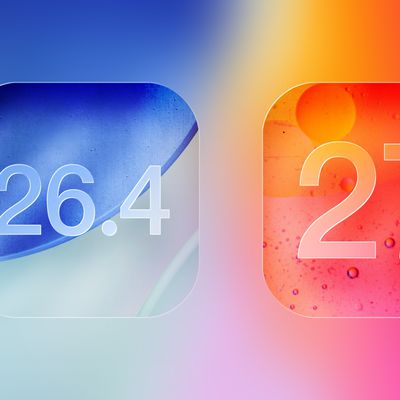
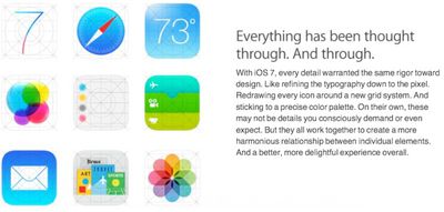
After Apple debuted iOS 7 on Monday, the website for the new operating system displayed a set of icons that were different from the icons found in the current version of iOS 7.

Apple has since updated the website, but the Weather, Passport, and Reminders apps looked notably different, with the Passport and Reminders apps displaying different colors and the Weather app displaying a temperature rather than the current cloud and sun design.

ios7oldicons

"Old" iOS 7 icons

While it has been suggested that the icons represent future design changes that Apple is planning for iOS 7, it is more likely that the icons are previous iOS 7 design iterations. Because the icons were present on the website when it went public on Monday, it is reasonable to assume that the icons were the result of outdated and overlooked marketing material rather than an unintentional leak of new content.

The "old" weather icon, for example, forgoes the current sun and cloud icon of iOS 7 for a simple number, "73." That is the same temperature icon that is used for the iOS 6 version of Weather, so it is probable that the text-only 73 was an older, simpler design iteration taken from the current iOS 6 icon. There is no indication that the icon represents a live temperature reading.

ios7newicons

Current iOS 7 icons

Passbook, too, looked notably different in the older version, with a confusing color scheme that heavily featured blues and greens. Reminders was updated as well, swapping out gray for green and yellow for orange, both of which are bolder colors. Arguably, the newer versions of the apps feature crisper designs and more prominent, easy to distinguish colors.

Though it is unlikely that the icons represent upcoming designs, it is likely that iOS 7 will see several graphical updates before it is released to the public this fall. As noted yesterday by The Next Web, the current design is a "work in progress."

Related Forum: iOS 7

Popular Stories

iOS 26

15 New Things Your iPhone Can Do in iOS 26.2

Friday December 5, 2025 9:40 am PST by
Apple is about to release iOS 26.2, the second major point update for iPhones since iOS 26 was rolled out in September, and there are at least 15 notable changes and improvements worth checking out. We've rounded them up below. Apple is expected to roll out iOS 26.2 to compatible devices sometime between December 8 and December 16. When the update drops, you can check Apple's servers for the ...
Intel Inside iPhone Feature

Apple's Return to Intel Rumored to Extend to iPhone

Friday December 5, 2025 10:08 am PST by
Intel is expected to begin supplying some Mac and iPad chips in a few years, and the latest rumor claims the partnership might extend to the iPhone. In a research note with investment firm GF Securities this week, obtained by MacRumors, analyst Jeff Pu said he and his colleagues "now expect" Intel to reach a supply deal with Apple for at least some non-pro iPhone chips starting in 2028....
iPhone 14 Pro Dynamic Island

iPhone 18 Pro Leak Adds New Evidence for Under-Display Face ID

Monday December 8, 2025 4:54 am PST by
Apple is actively testing under-screen Face ID for next year's iPhone 18 Pro models using a special "spliced micro-transparent glass" window built into the display, claims a Chinese leaker. According to "Smart Pikachu," a Weibo account that has previously shared accurate supply-chain details on Chinese Android hardware, Apple is testing the special glass as a way to let the TrueDepth...
iOS 26

Apple Seeds Second iOS 26.2 Release Candidate to Developers and Public Beta Testers

Monday December 8, 2025 10:18 am PST by
Apple today seeded the second release candidate version of iOS 26.2 to developers and public beta testers, with the software coming one week after Apple seeded the first RC. The release candidate represents the final version iOS 26.2 that will be provided to the public if no further bugs are found. Registered developers and public beta testers can download the betas from the Settings app on...
iPhone 17 Pro Cosmic Orange

10 Reasons to Wait for Next Year's iPhone 18 Pro

Monday December 1, 2025 2:40 am PST by
Apple's iPhone development roadmap runs several years into the future and the company is continually working with suppliers on several successive iPhone models at the same time, which is why we often get rumored features months ahead of launch. The iPhone 18 series is no different, and we already have a good idea of what to expect for the iPhone 18 Pro and iPhone 18 Pro Max. One thing worth...
Johny Srouji

Apple Chip Chief Johny Srouji Could Be Next to Go as Exodus Continues

Sunday December 7, 2025 10:41 am PST by
Apple's senior vice president of hardware technologies Johny Srouji could be the next leading executive to leave the company amid an alarming exodus of leading employees, Bloomberg's Mark Gurman reports. Srouji apparently recently told CEO Tim Cook that he is "seriously considering leaving" in the near future. He intends to join another company if he departs. Srouji leads Apple's chip design ...
Johny Srouji

Apple's Chipmaking Chief Johny Srouji Responds to Report About Him Potentially Leaving

Monday December 8, 2025 9:23 am PST by
Apple's chipmaking chief Johny Srouji has reportedly indicated that he plans to continue working for the company for the foreseeable future. "I love my team, and I love my job at Apple, and I don't plan on leaving anytime soon," said Srouji, in a memo obtained by Bloomberg's Mark Gurman. Here is Srouji's full memo, as shared by Bloomberg:I know you've been reading all kind of rumors and...
top stories 2025 12 04a

Top Stories: iOS 26.2 Coming Soon, Apple Execs Depart, and More

Saturday December 6, 2025 6:00 am PST by
You'd expect things to be starting to wind down for the holidays by now, but that doesn't seem to be the case yet in the world of Apple news, with Apple just about ready to release iOS 26.2 and other operating system updates to the public. There was also a flurry of news this week about Apple executive departures, some expected and some not so expected, while we also learned that Apple and...
maxresdefault

iPhone Fold: Launch, Pricing, and What to Expect From Apple's Foldable

Monday December 1, 2025 3:00 am PST by
Apple is expected to launch a new foldable iPhone next year, based on multiple rumors and credible sources. The long-awaited device has been rumored for years now, but signs increasingly suggest that 2026 could indeed be the year that Apple releases its first foldable device. Subscribe to the MacRumors YouTube channel for more videos. Below, we've collated an updated set of key details that ...
Apple Fitness Plus expansion hero

Apple Fitness+ Coming to 28 New Regions With Digital Voice Dubbing

Monday December 8, 2025 6:19 am PST by
Apple today announced that Fitness+ is expanding to 28 new markets on December 15 in the service's largest international rollout since launch, accompanied by new language dubbing and a K-Pop music genre. Apple Fitness+ will become available in Chile, Hong Kong, India, the Netherlands, Singapore, Taiwan, and additional regions on December 15, with Japan scheduled to follow early next year....

Top Rated Comments

santydolby Avatar
163 months ago
please change that hideous safari icon with a yucky white background! :(
Score: 44 Votes (Like | Disagree)
ipedro Avatar
163 months ago
I'm confident that Apple will adjust things as they move closer to release. They're not submitting iOS7 to developers 3 months early so that they can ignore all their requests. Some app icons seem to have been universally rejected so they'll be getting a flood of feedback on them.

The camera app is one of them. If they're going to drop skeuomorphism, then don't take half measures. Get rid of the old camera metaphor and use one that better represents cameras today: a lens works well.

I like this one for the camera...


... and this one for Safari...

Score: 43 Votes (Like | Disagree)
Matrixfan Avatar
163 months ago
First time I have ever been disgusted by an Apple product.:mad: I was expecting Apple to do away with the extreme skeumorphic stuff here and there, but this neonfest and ugly icons are horrible. I have a feeling all of this is in effort to gear up for the chineese market. As a european, It goes all the way against my taste.
Score: 32 Votes (Like | Disagree)
nagromme Avatar
163 months ago
For me, the Photo's icon is meaningless and does not suggest intuitively, that it is a Photo App.

Neither did a sunflower. But we learned.
Score: 24 Votes (Like | Disagree)
street.cory Avatar
163 months ago
Everybody Calm Down

Hate it? Keep the criticisms coming, but don't freak out. Detail your concerns in a detailed manner and more importantly let Apple know by submitting feedback here (http://www.apple.com/feedback/)

Love it? Let us know but don't worry! Throughout the coming design iterations the grand vision of what we've seen won't ultimately be scrapped or changed in a major way again for quite some time. Better yet tell apple here (http://www.apple.com/feedback/)

After seeing so much hate on Apple and other users of this forum for the biggest change to the iPhone since it came out, it makes me kind of sad. Let's please have some respect for other people's opinions and for each other!

Love you all!
Score: 22 Votes (Like | Disagree)
Mohammad Ridwan Avatar
163 months ago
People are crying over these icons, not because they're bad, but because they unfamiliar.
No, The icons ARE Bad, Ugly, Confusing and Inconsistent. :mad:

I still I can't wrap my head around the idea that the best industrial
designer Sir Ive would even consider these fugly icons let alone
approve it.

The whole "Translucent UI" on Notificaton and Control Center gives
me headache.It's difficult to read text easily when the background
app is too noisy. The ultra thin 'Helvetica Neue Ultra Light' font
which is used system wide is anotherthing that doesn't make it easier
to read. There are too much white space in the OS which is not easy
on the eye either. And the iMessage app is too ugly to even be on the
Windows Phone.

There are some good UI feature in the new iOS. But nothing terribly
new. Most of the UI is sadly copied form Windows Phone OS, WebOS,
Android and also Jailbreak Tweaks and then combined together. Which
isn't necessarily a bad thing but didn't work out well in this
instance.

To quote The Verge's Joshua Topolsky, "The design of iOS 7: simply
confusing". And It's only gonna look worse on the iPad which is my
real fear.

My complain is only with some of the UI design. Not the functionality.
I love how iOS 7 works and super excited about it.

I'm just hoping Apple Improve some of these UI before the final public
release. But I seriously doubt that would happen. As history teaches
us once Apple takes a decision they generally stick with it no matter
what...

Also wanted to add on the news that Jony Ive reportedly had Apple’s
marketing team design iOS 7 icons... I just don't buy it.

Jony Ive clearly said in the video they 'Developed' the 'Grid System'
to design harmonious icons. They also
showed their design philosophy of the icons in the video and Web site.
So it was well thought out.
Plus there is a section in Apple's new iOS7 marketing video where Ive
specifically talks about how beautiful the new icons are, so he
obviously endorses them on some level.

It's funny how they brag in the video about beautiful icons and they
are so ugly in reality. It's just not something I think worthy of being
an Apple Product.

The news sounds like a great excuse for a terrible reception to their
horrible icons. I like a lot about the new UI and I'm super excited
about the functionality, but the 'Icons all symmetrically aligned to a
grid' crap was embarrassingly bad. They just look awful.

Its not the end of the world though. They just need to get some
consistency happening, and ditch the ugly icons like Game Center,
Safari and the Camera altogether.
Score: 20 Votes (Like | Disagree)