The very different designs for Apple's and Google's planned headquarters buildings are a reflection of their corporate personalities, argues a professor of architecture at the University of Wisconsin - Milwaukee.
In an interview with Professor Brian Schermer by digital news site Quartz (via Business Insider), the workplace design expert comments on the two companies' respective plans for their new headquarter buildings.
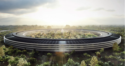
Apple is ... inscrutable. We don’t see the interiors. I have no idea how Apple would organize the building into different work groups. [It] is very tightly controlled. Maybe the Apple employee is somebody who’s attracted to that pure, shared vision — the Jony Ive aesthetic. [It is] an architecture that [one] is meant to behold. The company is shooting for timeless beauty.

Google’s business is somewhat sprawling and disheveled. They started off with search, and now they are getting into hardware, like Pixel and Google Glass. Similarly, their next campus is a thicket of ideas and places to be. The Google vision is perhaps to recruit people who are attracted to the serendipity of messiness. Architecture can be a very abstract language, but Google is wearing its heart on its sleeve. It’s trying to say that you can really inhabit this space.
Apple CEO Tim Cook mentioned Apple's new campus at yesterday's shareholders meeting, reiterating that Apple plans to move into the facility in 2016, with construction potentially beginning later this year.


















Top Rated Comments
Apple - Connected ecosystem
Google - Fragmented (even their ideas are this and that)
Both look stunning in their own ways, I think.
"The only problem with Microsoft is they just have no taste."
- Steve Jobs, 1995
This is also Google's problem.
You're either born with an aesthetic sense or you're not.
Sorry Google. You weren't.
They will also use cheap plastic instead of the continues high quality glass windows.