Handset manufacturer HTC is seeking to streamline the process for iPhone users to switch to the forthcoming HTC One by enabling it to extract data from iPhone backup files, enabling automatic transfer of photos, videos, calendar entries and text messages to the handset, reports CNET Asia.
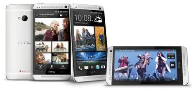
Transfers will take place using a new version of HTC's Sync Manager software, which already allows music to be imported from iTunes. By adding in the ability to copy across key data, HTC removes one key barrier to switching platforms.
HTC is heavily promoting a widget-based approach called BlinkFeed, which pulls live data from user-selected social and media networks onto the handset's home screen.
At the centre of the new HTC One experience is HTC BlinkFeed. HTC BlinkFeed is a bold new experience that transforms the home screen into a single live stream of personally relevant information such as social updates, entertainment and lifestyle updates, news and photos [aggregating] the freshest content from the most relevant and interesting sources, giving it to people at a glance, all in one place, without the need to jump between multiple applications and web sites. To enable this new dynamic approach to the smartphone, HTC will provide both local and global content from more than 1,400 media sources with more than 10,000 articles per day.
With HTC bringing BlinkFeed to Android and Windows Phone banking on its "live tiles" for its home screens, competitors are increasingly looking to move beyond grids of static icons popularized for the smartphone market by iOS. It remains to be seen how Apple will continue its evolution of iOS, particularly as consumer perceptions of "staleness" compete with Apple's focus on simplicity and consistency.








Top Rated Comments
I like having icons and pressing icons and expecting them to launch a single, well defined app, instead of drawing data from multiple obscure apps, which is just confusing.
I agree that simplicity is an absolute must for a smartphone, and it should only do what I ask it to do, nothing else. It's distracting enough as it is.
I hope Apple doesn't change too much of this with iOS 7. I wish they made multi-tasking better but I sure don't want the home screen to change.
Ditto.
I like your "spoon" analogy.
Prior to touch screens, the click wheel on the iPod was a near perfect implementation of simplistic controls. Why change something that works great? I can't remember where, but I recall a post in these forums once about how limited choice sometimes results in greater product satisfaction - by keeping people from feeling overwhelmed by options. It was more directed toward prodcut lines rather than software, but similarities apply.
I'm all for options, by the way, but if the basic interface is intuitive and works well, I wouldn't rush to overhaul it.
That said, if Apple truly came up with something better (and not just change for change's sake), I'd be thrilled.
Samsung & Sony etc, need to follow suit....
I agree, I don't get the all the "OMG iOS is stale, no new features" complaining. It's like claiming there's no innovation in spoons lately. I like it how it is thank you very much, I can get whatever reminders/notifications on the lock screen that I want. I don't want my phone keeping up to date on the weather, stocks, Facebook, etc... burning data and battery when I don't care about them. same goes for the screen size. I do think they should offer the phone parts as an option on the ipad mini for those who want it though.