Mailbox is an upcoming email management app developed by the team that designed collaborative task management app Orchestra, which was lauded for its simple design.
Mailbox, which is designed to work with Gmail, features a clean, simple design that uses intuitive touch gestures, much like list-making app Clear. Quick swiping emails to the right removes them from the inbox and archives them, while a longer slide and hold deletes them.
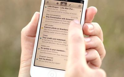
Reorganization of the inbox is also a simple task with drag gestures, and the app also allows users swipe left to "Snooze" emails, putting them out of sight and out of mind until later.
TechCrunch has an early hands-on review of the app:
Mailbox takes a very stripped-down approach, providing a limited set of options for dealing with email. It breaks incoming emails into three basic categories: Those you’d like to keep in your inbox, those you'd like to save for later, and those you'd like to get rid of as quickly as possible.
The whole thing is built on the concept of gestures, basically swiping left or swiping right over an email in your inbox to do something with it. Want to archive an email? A short swipe to the right will do that, clearing it from view. Want to delete? Try a longer swipe right.
But the most interesting aspect is the save-for-later option. Don’t have time for an email right now but want to respond at some point? Just swipe to the left. Once you do, you’ll be met with a few options for when you want that email to appear in your inbox: later in the day (three hours later), tomorrow, on the weekend, next week, etc. It then clears those emails from the inbox but makes them easily accessible from the menu screen. It works the same for adding emails to lists, like a "read later" or "watch later" list. It just needs a longer swipe.
The Verge has also had the opportunity to test Mailbox, calling the app "nothing short of spectacular."
Though there are a slew of emailing apps available, including Apple's own Mail app, Google's Gmail app, and third party alternatives like Sparrow, no email client offers the innovative quick-swipe interface of Mailbox.
Mailbox is in closed beta at this time, but the website states that it will be available for iPhone + Gmail after the new year.













Top Rated Comments
Gotcha ! /coolstory
If you are too lazy to read, how are you going to know if/what someone responds to your question? :rolleyes:
Oh, and no, I'm not going to give you the answer even though I'm wasting my time writing this.
Also no Exchange support.
So, no thanks. Design looks nice, and some nice UX ideas there, but going through their servers is a non-starter for me.
The colored indicators are quite clear when you swipe but I think it's just a matter of getting used to it. My first thought from this demo is how intuitive and simple it was. I already use and prefer apps that use gestures like tweetbot, reeder, pocket, sparrow, chrome, etc... It did not take long to gain that muscle memory. A quick swipe is always faster and less tedious than 2-3 taps. If you thought this looks brutal you should see the gestures I have with bettertouchtool on my macbook air :p