Philipp Seibel of eightloops let us know that his company was working on a fresh new take on the OS X email client. There has been a bit of a resurgence in the interest of alternative Mail clients since the launch and acquisition of Sparrow, which has left some customers abandoned.

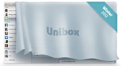
Eightloops' new client is called Unibox and borrows a lot of organization and interface cues from chat clients like Messages. Like Messages, the interface consists of two panes: contacts on the left and messages on the right. The contact list is ordered by last received message and all emails from that contact are consolidated into that one entry:
Due to the fact that contacts only appear once in the list, many short back-and-forth emails don't clutter your inbox, they just result in moving the respective contact to the top. Another nice side effect is that notification emails from twitter, facebook, amazon etc don't spam your inbox but are limited to one entry in your contact list.
On the right side, incoming messages are displayed in a chat-like interface with incoming on the left and outgoing on the right. Outgoing messages are also written in the right hand column with support for editing, formatting, and attachments.
Meanwhile, attachments from a single contact can be viewed in a Finder-like interface. Seibel notes that this creates an interesting side effect:
Displaying attachments this way creates some interesting new views on your emails and contacts. Attachment grids of a family member or friend mostly look like shared photo albums while attachment lists of co-workers and business partners are like a shared dropbox that contains all the relevant business documents like design assets, word documents, excel sheets, etc.
Seibel wasn't willing to release full interface screenshots quite yet, but expects the app to be released this winter. They have set up a teaser page at UniboxApp.com that will notify you when the app is released. Seibel's company has been a longtime Mac developer, but has focused on contractual work in the past. This is their major independent Mac project that they've been working on for over a year.


Top Rated Comments
Hotmail? People still use that?
If you want to win over the hearts of many mac users (make that many COMPUTER users) - make an email app that is fully compliant with the latest specs for SMTP, POP3, and IMAP protocols. That includes all extensions, such as encrypted email, MIME compliant, etc. Give me a client that allows me to design beautiful HTML5 emails and store them as templates. Let me pull in content from various places, (yes, even from Social Networking sites). Make sure it works with web based email as well as possible. Add the proper handling of RSS feeds. Add the ability to script the client, and integrate it with the rest of the OS as much as possible. Support calendaring, note taking, and tasks.
In short, make it an EMAIL app... once you do that, if you still want to add social networking to it, then knock yourselves out.
Speed is another. Having my iPhone check one IMAP account is pretty quick. The Mail app is pretty lightweight compared to a web browser; the interface is very fast and doesn't include junky ads, unlike webmail.
At home, my Mac has four accounts configured. Yes, I could have the other three accounts forward to my primary account, but I don't want to do that. Two of the other accounts are used for junk mail. I don't want these accounts forwarding messages. The third is a legacy account that rarely has any traffic. Sadly, that service provider's junk mail filters aren't very good, so I tend to get more spam in that inbox, again something I don't want forwarded along.
Yes, I could fire up four webmail instances in a tabbed browser, but it would be slower than just firing up the Mail app on my Mac. And using the standalone mail application, how many news items, photos, ads, do I need to look at before I open my first e-mail message? None. Nada. Zilch. Plus, I'm not waiting for UI elements or "rich media" to download.
Also, with more mail providers, you get more webmail interfaces. It's pretty tiresome going from one webmail to another, the buttons are never in the same place, etc., especially if a banner ad squeaks by, etc.
With a standalone mail client, the user interface remains constant, regardless of the e-mail hosting provider: Yahoo, Gmail, AOL, Hotmail, GMX, whatever. I don't have to hunt around for constantly changing UI buttons. Heck, even different web browsers render the same webmail site differently. And some browsers aren't even supported. You can't use iCab on AOL Phoenix, you're forced to use a legacy webmail interface.
And worse, the same webmail provider may have multiple GUIs. Yahoo Mail can be accessed via a variety of My Yahoo! widgets. Worse, the full-blown webmail has at least three interfaces: Classic Yahoo! Mail, new Yahoo! Mail (was Beta), and there's a tablet-oriented Yahoo! webmail that's totally different from the previous two.
And let's not even bother to discuss the topic of webmail keyboard shortcuts...
Note that the iOS Mail app will run in the background, using pretty minimal resources. At home, if I am not actively reading e-mail, I will often have the Mail.app off. That's right: nothing to bother me. No notifications, no dock badge, etc. Yeah, I can hear incoming message notifications on my phone, but often I'll ignore them.
One thing for sure, the iOS Mail app makes it easy to quickly scan through your e-mail with one hand, usually with just my thumb.
Another idiosyncrasy of the iOS Mail app that I love is the fact that I don't know how many junk messages I have unless I deliberately go inside the folder. One less distraction. On my iPhone, it's even better as I typically am just looking at the Inbox. Unread messages in other folders? I won't see them, unless I back out and look at the Mailboxes view.
Another issue is integration with Contacts and Calendar. If I get an e-mail from a new address for an existing contact, it's pretty easy for me to associate it with that contact, particularly on my iPhone. It's far clunkier trying to do this on webmail. Contact management is atrocious if you are using more than one webmail interface. Webmail address book UIs vary a lot more than the webmail UIs.
For me, life is far easier thinking of webmail providers as dumb pipes. I don't really care about Gmail/Yahoo! Mail/AOL/whoever's interface. I just need your IMAP server for incoming mail/message storage (and spam filtering) and your SMTP server for outgoing mail.
The main benefit I can see from my webmail providers is filtering. You set it up, then get on with your life. Incoming messages get routed to certain folders.
It looks promising, but it still leaves a lot of questions as to how certain things will function.
I hope the search is just as good as Sparrow. That is one of the best in Sparrow.