Last year, Apple unveiled a new, streamline Fifth Avenue cube that reduced the number of glass panes from 90 to 15. This year, Apple Retail revamped the SoHo store with an extensive expansion into space once occupied by a United States Post Office.
Along with adding more sales space, Apple's architects redesigned the famous glass staircase. Apple first unveiled the glass staircase design at the SoHo location in 2002, a design that has made its way to dozens of high-profile stores.
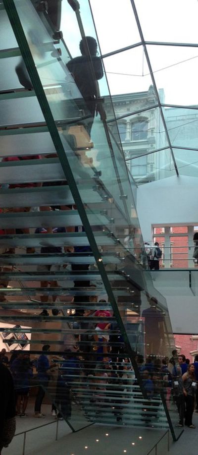
With the SoHo redesign, Apple has done to the iconic staircase what it did to the Fifth Avenue Cube. Instead of stitching three pieces of glass together to make the sides of the staircase, Apple has built a 30-foot long, zig-zagging single pane of glass. The sides are made out of 5 single sheets of glass laminated together.
Core77 has a number of other photos of the new staircase that are worth exploring.









Top Rated Comments
It means Apple's insane attention to detail is intact, even though Steve is gone.
That's great news.
All comes from the pursuit of perfection embedded in this company by Steve Jobs. The stairs didn't have seams because they knew it would have seams. Just like how Paul Jobs taught Steve to paint the other side of the fence even though no one would see it. The whole idea is that you know it's there.
You are correct, they could save so much money selling products out of this building:
I mean who really wants to visit a nice store?
When I was shopping for a fridge, I had to have stainless steel, even though it was more expensive. And when I found one that had tons of LED lights that faded on when you opened the doors...I HAD TO HAVE IT. It was $400 more than I wanted to spend, but 2 years later, I still love opening that fridge...every time. Once perfection is defined, some people gotta have it. ;)
Spelling on the other hand, we don't care for so much. :p
You're under the mistaken impression that money is any factor whatsoever to Apple.