The Financial Times' web app has drawn more than 1 million readers since June, growing by 300,000 readers since late September. However, the raw numbers don't tell the whole story.
In its press release about breaking the 1 million mark, the FT staff built an infographic with data from its mobile website. 20 percent of FT page views are from mobile devices, and 15 percent of its digital consumer subscriptions initiate on mobile, showing that the paper is having good luck attracting readers to its pricey business-focused readership.

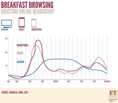
But most revealing is this chart showing the distribution of readership broken out by time-of-day and whether readers were using a smartphone, tablet, or reading on a desktop. As a financial paper, this data reflects the behavior of a higher-income, white-collar readership.
Smartphone and tablet readership spikes in the morning, then drops as readers use their desktops to keep up with the news during the day, then tablet use rises in the evening as users commute and arrive home.


Top Rated Comments
My guess is that they were in a hurry and simply enlarged the smartphone icon for the tablet icon and and meant to recolor one of them, but recolored the wrong one and forgot the text.
Assuming that coloring is the only mistake and that positioning on the graph is accurate, this is what it should look like.
No kidding.
Consistency. It's a good thing.