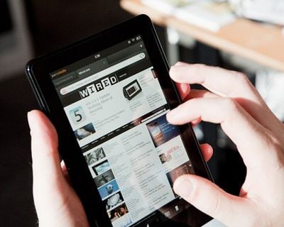
Amazon's first color tablet, the Kindle Fire, began shipping today following its September introduction. The Fire, the top-of-the-line Kindle tablet, has reportedly given some potential iPad purchasers second thoughts as the Fire is some $300 cheaper than the least-expensive iPad.
- "It is designed almost exclusively for consuming stuff, particularly material you buy from Amazon, like books, newspapers and video. It has no camera, microphone, GPS function, Bluetooth or memory-card slot. There is a serviceable e-mail program, but no built-in calendar or note pad."
- "You feel that $200 price tag with every swipe of your finger. Animations are sluggish and jerky — even the page turns that you’d think would be the pride of the Kindle team. Taps sometimes don’t register. There are no progress or “wait” indicators, so you frequently don’t know if the machine has even registered your touch commands. The momentum of the animations hasn’t been calculated right, so the whole thing feels ornery."
- "The Fire deserves to be a disruptive, gigantic force — it’s a cross between a Kindle and an iPad, a more compact Internet and video viewer at a great price. But at the moment, it needs a lot more polish; if you’re used to an iPad or “real” Android tablet, its software gremlins will drive you nuts."
- Wired
- "Pixel for pixel, the tablet’s 1024×600 display actually delivers quite nice image quality. Swaddled in ultra-protective Gorilla Glass, the display uses in-plane switching (IPS) technology to deliver a bright, appropriately saturated screen image with solid off-axis viewing (meaning you can still see what’s on screen when looking at the display from an exaggerated angle)."
- "As far as performance, all the apps I tested worked fine on Amazon’s hardware — as well they should have, because not only have they been pre-approved by Amazon, they were also designed for Android smartphones, which (theoretically) boast less processing power."
- "Despite all claims from Amazon that its Silk browser technology would bring sublime web-surfing performance to the Fire’s desktop, I found the tablet’s overall web experience to be quite ratty."
- Mashable
- "This is a product I wanted to love. The Kindle Fire’s unveiling was so impressive. Jeff Bezos hitting all the right notes in true Jobsian fashion, telling the tale of a product vision so clear it made my eyes tear up. Instead, now I’m discovering it’s a somewhat flawed gadget — a product that literally does not always know which way is up."
- "This interface is not always optimized for 1024×600 resolution on a 7-inch screen. While the bookshelf and items on it are large, some of the controls are tiny."
- "It is the closest tablet I’ve seen yet to an Apple iPad: a consistent, well-thought out marriage of hardware and services that offer an almost frictionless environment for app purchase and content consumption. This is why the iPad has been so successful and why I think the Kindle Fire, despite its imperfections, is a winner, too."
- "It's been speculated on (and more recently stated as fact by Barnes & Noble) that Amazon used the [BlackBerry] PlayBook reference design as the basis for the design of the Fire, and I wouldn't be surprised if that were true. Don't get me wrong, it's not that the design is necessarily bad — it's just that it's incredibly unoriginal."
- "Unlike the PlayBook, iPad, or pretty much any other tablet on the market, the Fire has no hardware volume controls, meaning that you have to go through a series of taps (especially if the device is sleeping) to just change the volume. The Fire also has no "home" button — simply a small, hard-to-find nub along the bottom used for sleeping and waking the device, and powering up and down."
- "I found magazine reading to be a little cramped on the small display, and zooming and panning around lacks a smoothness that would make the experience more enjoyable."
- Andy Ihnatko, Chicago Sun-Times
- "Kindle Fire is explicitly a device for enjoying books, periodicals, music, video, and games. But it can also handle the sort of computer-ish tasks that are often necessary distractions when you spend an hour or two in a coffeeshop reading a book. Things like checking email, looking something up on the Web, or telling your Twitter and Facebook friends that this dude who just walked into the coffeeshop has the most awesome mane of heavy metal hair spotted in the wild since Poison concluded their ’86-’87 “Look What The Cat Dragged In” tour."
- "The reader app lacks the lovely little flourishes found in an iPad book reader. Page turns are mechanical, with little thought to transitions or interactions. When you’re reading content that benefits from a little manual panning and zooming (like the contents of a webpage, a PDF, or a hard-formatted digital magazine), the experience is very Android-ish. Effective, yes, but not anything like the instantaneous liquid feedback you get from an iPad."
- "Steve Jobs, in the middle of lambasting 7-inch tablets as an utter disaster, insisted that they could only work if the box included enough sandpaper to grind down the user’s fingertips to half their normal size. Well, that’s just rubbish. All around, the Fire is as good a reader as the iPad. The two different screen sizes are just better in different scenarios."
The Kindle Fire is $199, available now from Amazon.







Top Rated Comments
I hope that they can improve this, if for no other reason than to incentivise Apple to lower the price of the iPad or really load up the feature set in the next revision.
Imagine that...a fan of Apple writing on MACRUMORS. Judging from your post, I'd say you were the one who is a little "butthurt" by this article.
And therein lies one of the biggest problems for me with Android. I don't want to mess around with it to get it working reasonably well. I've spent plenty of years tinkering and now wish to spend my time on other pursuits. Some people enjoy custom ROMs and tweaking settings but I'm over it.