Marco Arment has released a major update to his popular reading app Instapaper, bumping it to version 4.0. Instapaper allows users to save articles for later offline reading and strips away the advertising and formatting to present article text in a clean and easily viewed format.
Instapaper is a $4.99 universal app. Arment has extensive notes about the update on his site, but here are a few new features:
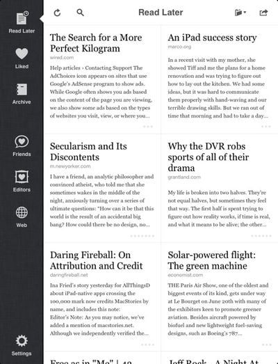
The iPad browsing interface has been completely redesigned to feel more at home in the iPad environment. Instead of just being a blown-up full-screen list, it’s now a more touch-friendly grid, with all navigation available in any orientation:

The iPhone reading screens also no longer show the top status bar by default (but there’s an option to put it back). This gives a larger, less distracting reading area without sacrificing easy access to the toolbar or annoying customers with finicky full-screen tap modes.

Get the full change list from Marco's blog. Instapaper is a $4.99 universal app for iPhone and iPad on the App Store. [Direct Link]


Top Rated Comments
Pluses (in the order of significance for me):
* Draggable scroll bar. About time!
* Improved social UI.
* Grid based list on iPad.
* Integrated hardware brightness control for both iPhone and iPad.
* Footnotes.
Minuses:
* Title-based search: Well, I've used this feature in the past and it's gone. It is now part of $12/year full content search subscription. I have only few dozen articles, so that is overkill for me. I understand Instapaper is heavily server side and $12/year goes long way to help Marco host the service and provide many more valuable updates for free. Still, I can't help but feel disappointed that title-based search is completely gone.
* No multi-page article support. Marco wrote in the past (http://www.marco.org/2011/07/19/siracusa-multipage) regarding this omission. While his view has merits, it's a disappointing omission. Just show the banner ads if you must.
* Social contents (friends, editors) not defaulting to "read later" view.
----------
As I mentioned earlier, I have both Instapaper and Read It Later Pro. UI is subjective, of course, but to me, Instapaper is far more fluid experience. And Instapaper's UI has progressed significantly over the years, especially for iPad. I wouldn't call Instapaper a beauty in truest sense, but it is a prime example of minimalist UI done well.
Nailed it.
Marco understands Apple's quality of design. Not veneer or specs but how it works and how people think and use a product.
The other thing that Instapaper has over competitors is that Marco has made it easy for other developers to integrate Instapaper support into their apps. And it's highly respected in the industry leading developers to consider Instapaper support as significant added value for their apps.
I have used both Instapaper and Read It Later. Read It Later leads in spec sheet war, such as ability to edit feeds, show unread articles on the badge, and multi-page article support. But overall, both the rendering and UI lack the maturity and polish that Instapaper has. Most of Instapaper features are carefully thought of, not just at attempt at increasing number of features.
Overall, I equate the comparison to:
iOS:Android = Instapaper:Read It Later