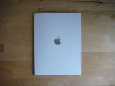
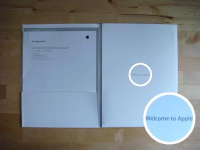
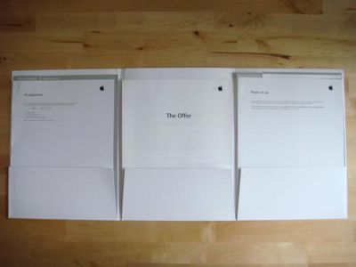
On his Deciphering Glyph blog, the founder of Twisted posts "unboxing" photos (via Gizmodo) of a job offer he recently received from Apple. The photos unsurprisingly reveal that the company that places such emphasis on design aesthetics for both products and packaging also appears to have put a fair amount of effort into its human resources materials, resulting in a sleek appearance likely to appeal to and impress potential employees.
The tension on the hinge of the folder is perfect: not too tense, not too loose. It opens easily and will lay flat on any work surface. In case I didn't actually know who they are or what it was, the words "welcome to apple" adorn the inner flap.
Tab separators along the tops of the section allow me to quickly find the files that I need. If you're not familiar with paper technology, this is not unlike the "tab" widgets you might see along the top of a browser window such as Firefox and Safari. They work by placing your finger on top of the desired "tab" and lightly pulling. Perfectly intuitive.


