We took a first look at the TomTom U.S. & Canada turn-by-turn navigation app a short while ago, and have taken it through its paces over the past few weeks to complete our full review of this highly-anticipated app.
Navigation Guidance
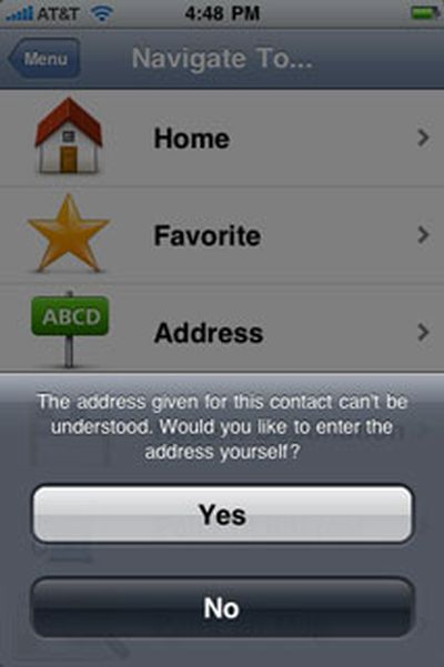
The TomTom app offers several options when choosing a destination. Contacts integration is built-in, so it's easy to select a contact as a destination, and we really like this ability. However, we found that we'd often get an address format error when selecting an existing contact, even with addresses that appeared to have nothing out-of-the-ordinary about them, containing a simple street address in a city that exists in the TomTom's map data with everything correctly spelled:
We found that navigation guidance showed us off the side of the current road more often than we would have liked, even under weather and set-up conditions where other GPS apps, such as Sygic's MobileMaps and Navigon's MobileNavigator, showed no such problems. We also noticed that it lagged somewhat behind our current location, often showing us slightly behind an intersection that we were actually passing through. This lag can be confusing, especially if you are in an unknown location, which is of course where you are most likely to use a navigation app. We switched to 2D view to see if this was still the case and found no change in this behavior. In switching to the 2D view, we noticed that the "2D Map North Up" setting is on by default, which can be a little disorienting when you switch from the 3D view, which has no such setting, to the 2D view on the fly.
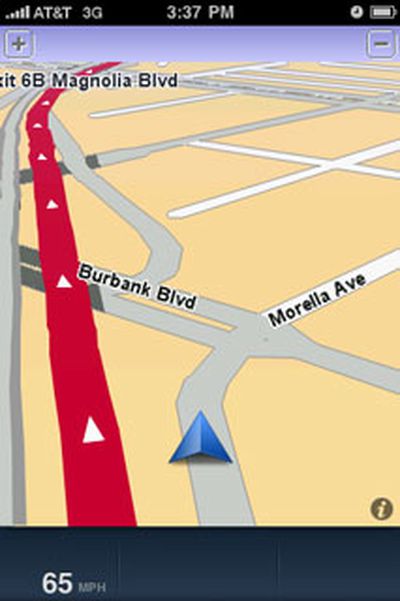
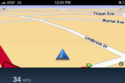
Off-road excursions we never really took
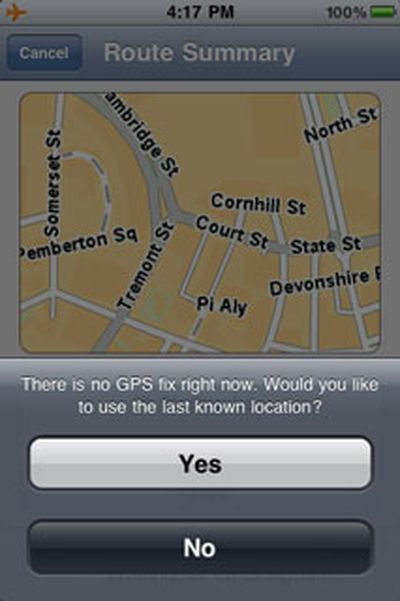
If you're starting out and try to select a destination before the app has obtained a GPS signal, you'll get a message asking if you'd like to start navigation from the last known location. While this is nice, particularly compared to Navigon's MobileNavigator's only option to view a simulation of the planned route from a starting point of its choosing, we'd prefer to see more options, such as the ability to start from your Home location or a previous destination if you're in a hurry to get going.
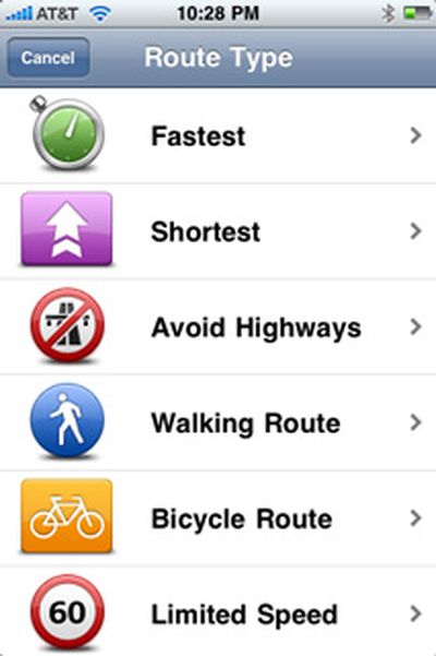
Once you've set a destination, you can also choose to generate a route for walking or riding a biycle. After the route has been generated, you can easily calculate an alternative to avoid a roadblock, travel via a certain road, and more. You can also see a demonstration of the route, read written route instructions, and browse the map of the route using the iPhone's standard pinch-to-zoom gestures.
The app correctly identified all toll roads in all our tests and can let you know before you start out that you'll encounter one on your route. It also shows speed limits and indicates when you're traveling above the speed limit by changing the numbers displayed to red. There is no option to provide any audible alert when you are exceeding the speed limit. This speed limit information only appeared on interstate highways during our tests and showed current vehicle speed at all other times. Unlike competing apps, including MobileNavigator and MobileMaps, the TomTom app does not provide any on-screen lane guidance to help you identify the best lane to be in on a multi-lane road.
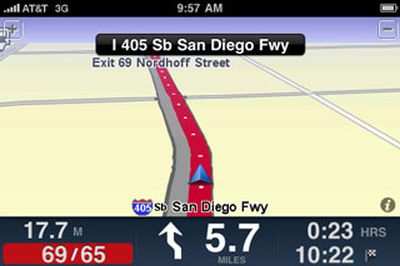
The speed limit notification
When traveling on an interstate highway, we noticed that the TomTom app gave potentially confusing information about upcoming exits. For example, it would announce that an exit we needed to take was coming up about 2 miles in advance of the exit by saying "Exit approaching on the right." This would prompt us to look at the next upcoming exits on the highway and then compare it to the next exit shown on the TomTom app to ensure we didn't need to exit right away. It would be less confusing if the app stated how many miles we needed to travel before exiting, such as "Exit approaching in 2 miles."
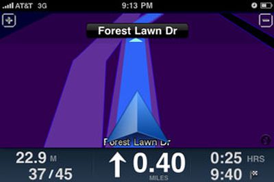
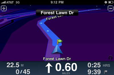
The maximum and minimum zoom levels during navigation
The app offers voice guidance in multiple languages, unlike Navigon's MobileNavigator app for North America that only offers guidance in English. However, TomTom's app does not provide any text-to-speech capabilities at all. Sygic's MobileMaps offers some text-to-speech capability for numerically-named streets, such as highways and interstates and has announced that complete text-to-speech capability is coming in future app updates, while Navigon's MobileNavigator was just updated to bring full text-to-speech capability to the app.
Perhaps our biggest issue with the TomTom app's navigation guidance is that it does not tell you which side of the road your destination is on. You can always pay attention to the street addresses and find it yourself, but driving, hunting for addresses on buildings, and paying attention to navigation guidance is not always the safest combination. Additionally, Navigon's MobileNavigator and Sygic's Mobile Maps provide this information and it's disappointing to see TomTom not matching its competitors here.
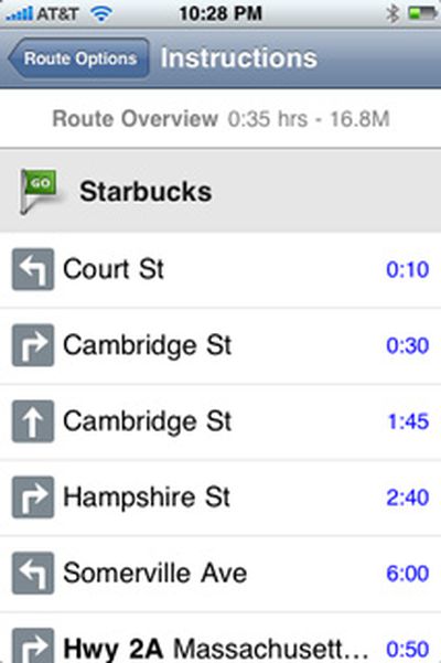
Written instructions of a route
The TomTom app also offers the company's signature IQ Routes feature, which promises to offer the "smartest, most efficient" route based on road data collected from millions of drivers. You probably won't notice it in action unless you are very familiar with an area and its traffic patterns already and repeatedly use the TomTom app to navigate the same route at various times of the day. IQ Routes was most evident for us when using the Advanced Planning feature. In the following screenshots, the same route was calculated with different starting times. The route planned with a starting time on a Sunday afternoon yielded a more direct route, while the one planned during rush hour on a weekday morning gave a different route that detoured around common congestion areas in downtown Boston. This feature will prove particularly useful to those who need to get around a busy metropolitan area at peak traffic times.
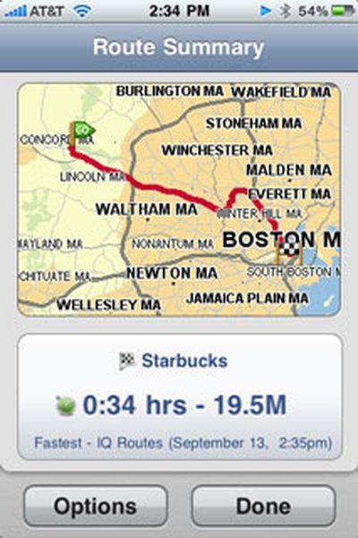

IQ routes: weekend route (left) vs. weekday rush hour route (right)
We found that the app's navigation guidance was more or less accurate and trustworthy enough for us to not feel the need to double-check it against another source. We did encounter a few hiccups, such as an incident where it wanted us to go around a block to get to a destination instead of continuing straight on and making a left turn to get there. We captured a screenshot of this situation where you can see the red line indicating the intended route and the edge of the finish line flag indicating the destination ahead of us on the current road:
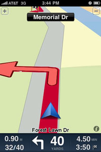
No need to go around the block to get to our destination
While the TomTom app offers reliable guidance, we remain disappointed by the features that competing apps offer that TomTom's more pricey offering does not, IQ Routes notwithstanding.
Map Data and POI
TomTom acquired Tele Atlas, one of the major providers of map data, in 2008, ensuring a direct source of map data for its navigation products. The TomTom app includes the most recent version of Tele Atlas maps at this time at version 8.30. In its FAQ, TomTom has not provided specifics on how much updates will cost, noting the following:
"At the moment the app comes with the latest and most up-to-date map. In future we will provide regular updates and make it possible to update the existing map."
Another FAQ response indicates that several free updates to the app itself will be provided this year.
We found the app's POI database to be very good in most cases, allowing us to find popular retail chain stores as well as independent, non-chain stores all the way from Target and Lowes to a small Korean grocery store. We did have difficulty locating Forest Lawn Memorial Park in Los Angeles, one of the largest cemeteries in California, which could not be found in any POI category nor through a search of the entire POI database. We realize that a cemetery may not be a popular destination for many, but the size and prominence of this site makes its absence from the POI database feel like something is amiss.
We did encounter a glitch every now and then when performing a search of the entire POI database. When the search results appeared and we selected one, we would sometimes get an error indicating that no search results could be found. We would then need to repeat the search but could always select the desired POI without a problem the second time around.
Integration with iPhone Functions
As suspected in our First Look review, the TomTom app does not use the iPhone's ambient light sensor to automatically adjust the map color scheme between day and night modes, requiring you to switch between them manually. Also as previously noted, music playing through iPod app stops and starts abruptly before and after voice guidance a smoother approach here would be much appreciated.
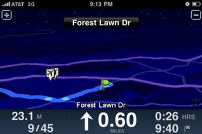
One of the available night themes you'll need to switch to manually
Switching between landscape and portrait view is smooth. Incoming calls take you to the standard iPhone active call screen. For calls received during navigation, ending the call causes the app to open to open up again by itself, but we found it did not always return to navigation guidance on its own, requiring us to re-select the desired destination again from time to time. The app will automatically override your iPhone's auto-lock setting and will keep the iPhone's screen on during navigation at all times, though it does adhere to the screen brightness level set.
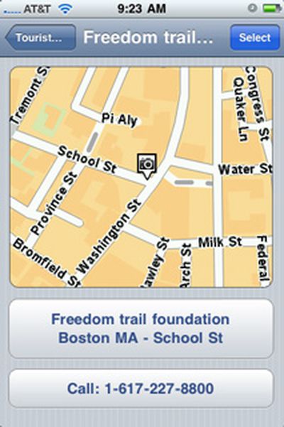
The option to call a POI directly from within the app
As expected, the TomTom app uses quite a bit of power, appearing to decrease battery capacity by about 5% for every 10 minutes of guidance (with Wi-Fi and Bluetooth on and screen brightness set to about 40% of its maximum level). Despite this level of power usage, an iPhone-approved Belkin car charger could still charge the iPhone while the TomTom app was being used, albeit at a slower rate than it does when the iPhone is in sleep mode.
We found that the TomTom app incorporates well the UI feel and gestures of the iPhone's stock apps and our only wish was for a 'Done' button in all screens to avoid the need to step back through multiple layers of nested menus to go back to navigation guidance.
We do want to note that the TomTom app was impressively stable through our testing, never once shutting down for no apparent reason in the middle of providing navigation guidance.
Summary
The iPhone GPS app market is turning into a heated one with apps from multiple providers, both all-in-one and subscription-based at a wide variety of price points. TomTom's app has been one of the most talked-about apps in this space following its announcement at the Worldwide Developer Conference in June, though it made it to the App Store later than many competitors. It also made its appearance in the App Store at a higher price point than many of those competing apps. At $99 for the North America version, it is $10 more than Navigon's comparable offering and $20 more than NNG Global Services' and Sygic's comparable offerings at the time of this review. Many of these apps offer more features now with more promised in the near future, as we've noted.
TomTom's app is a solid one that will suit the majority of users without any problems. However, it's not so stellar that we'd recommend it over all other competing apps hands-down, particularly at its $99 price point.
Note: TomTom's GPS Car Kit was not available at time of this review.


