Soulmen's popular Markdown text editor designed for writers, Ulysses, has long been available on the Mac and is one of the more popular Mac-based writing apps due to its clean, text-focused distraction-free interface and it's organizational system. As of today, Ulysses for Mac is getting a major update and it's also expanding to the iPad.
For those of you unfamiliar with the app, Ulysses sets itself apart from other similar writing apps with a three-paned sidebar that lets users see all of their files in one place and its ability to organize files using groups and filters. Writing takes place on sheets, and files are stored locally on the Mac or in iCloud. Markdown text written in Ulysses can be exported in several different file formats, including PDF, ePub, and HTML.
The newest version of Ulysses for Mac includes a new name (dropping the former III) and a new icon -- a butterfly. It's been updated with a Yosemite-style redesign that includes an attachment bar, Favorites on the sidebar, and a new Dark Mode. Quick Export and Preview have been updated, adding TXT and ePub previews, plus export optimizations.
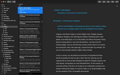
The biggest change to Ulysses for Mac, aside from the redesign, is its integration with the new Ulysses app for iPad. The Mac app fully syncs with the iPad app via iCloud, making it easy to begin work on one device and pick up on another. Handoff support is also built in.
"Our ideal conception has always been to make Ulysses a universal tool that authors can use for any writing task, at any time and everywhere. Bringing it to iPad means a great leap forward towards turning this into reality", explains Max Seelemann, head of development and co-founder of The Soulmen.
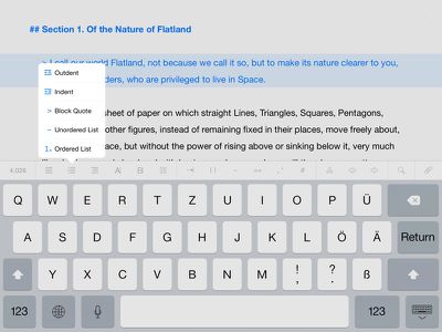
Ulysses for the iPad will be immediately familiar to anyone who has used Ulysses for Mac, as the interface and feature set are nearly identical. The iPad app uses a three-paned setup, and panes can be open or closed with swipes. A button row above the keyboard has been added to make it easier to format text, with access to special characters and shortcuts for creating headings, lists, paragraph blocks, and more. An info bar displays word count, sentences, characters, lines, and pages.
Ulysses for iPad supports filters much like the Mac version, and attachments like notes and images can be added. It also exports to all of the standard file formats the Mac app exports to, including Plain Text, HTML, ePub, PDF, and RTF. When an external keyboard is attached, Ulysses for iPad supports all standard shortcuts, and the look of the app can be customized with Themes, found in the Settings menu.
Both of the new apps are available for download today. Those who already own a copy of Ulysses for Mac can upgrade at no cost. The new Mac app is, however, exclusive to Yosemite -- it won't run on older versions of OS X.
Ulysses for iPad can be downloaded from the App Store for $19.99. [Direct Link]
Ulysses for Mac can be downloaded from the Mac App Store for $44.99. [Direct Link]













Top Rated Comments
This is just DARK MODE. You can customise EVERY aspect of Ulysses... fonts, colors, background and so on and even save them as themes.
You can also create your own export styles and get a PDF or HTML formatted exactly the way you want with just 1 click.
It also stores all you text files in a library and syncs them to all your devices PLUS you can write different chapters as separate files and just select them and export them combined as an ebook or ibook.
Ulysses is awesome, but you can't tell that by looking at a screenshot.
The course I'm doing, matched with my general learning style, prefers a linear note taking process. Lecturers can talk so fast that writing by hand is not very viable, and there's a few reasons why Ulysses wins over Word or Pages:
On the fly formatting: I'm a bit of a cheat here in that I don't use Markup for its intended purposes. I modify the markup templates so that they look good and colourful just as they are (i.e. pre-export). For example, _Homicide Act 1957_ is what I type, but what I get is a bold, red text with a yellow highlight. This lets me quickly identify the cases and statutes that I write when I am in lectures. **Lord Denning** gives me that name in a bold font, and so on. It's also much faster than highlighting text and manually changing the fonts and colours each new line.
Everything in one place: Opening multiple word files to find what I want is a pain, right? With Ulysses I can click a folder on the sidebar in the app, enter a search term and it instantly finds me all the lectures where that word is written, and clicking on each result takes me straight there. And you can organise multiple projects into multiple layers... check out my screenshot below.
No distractions and no clutter: A lot of people I know open Word for Mac 2011, with its ugly UI and huge header / menu bars, to type their notes. In order for this to be viable on a laptop screen with the lecture slides snapped to half the screen, they have to zoom out to the point where font is barely legible. My process is simple: Snap the lecture notes left, Ulysses' 'editor only' view right, and I can see the slides and my notes clearly and neatly.
It's also super easy to print out my notes and annotate them with revision questions on the left and summaries at the footer, like the Cornell note system.
Furthermore their support are incredibly helpful: fast response times and you can tell they know exactly how to help you.
Example below;
This is neither a Markdown editor or a GTD app. -2
It can *do* Markdown, but it's one of only a few professional-grade writing apps that have made the move to iOS.
Scrivener for iOS, the one I'm personally waiting for has been in development since 2011 or 2012 I think. We'll be lucky if it comes out this year.
If you're not a writer, or you have no interest in writing, find another thread to troll.
Try writing a 100,000 word book in Pages or Word and let me know how you get on.
I use this app, and I love it! Thank you for showing a detailed use for Ulysses because a lot of people complaining about this app have never used it nor understand what it can do along with how it's built to manage your data.
I'm happy to see prices go up on these things because although there's lots of choice a lot of those apps are pretty much dead through lack of money and I still haven't found the one that has the four things I need.