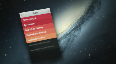
 Popular iOS to-do app Clear is coming to the Mac complete with iCloud cross-platform syncing. Clear launched earlier this year to strong reviews of its minimalist interface. The app is designed to be extremely quick and easy to use, with lists automatically color coded in order of priority. The Mac app is expected to be released next week on November 8th. Realmac, the creator of Clear, plans to price the Mac version at $15. It will require OS X Mountain Lion.
With Clear for Mac, we wanted to spearhead a new design direction for Mac UI that focuses on simplicity. Featuring nearly all the gesturally-driven interactions from Clear for iPhone as well as a complete set of keyboard shortcuts, Clear will revolutionise the way you interact with your Mac.
Update: Nik Fletcher, product manager for RealMac Software, commented in the MacRumors forum about the pricing decision on Clear for Mac:
Thanks for your feedback, guys. It's interesting to hear your thoughts on the app and pricing. Pricing it is always tricky, and whilst some folks may think that pricing is something that is simply determined at the last moment, that's not the case with us. We gave the Clear pricing a **lot** of thought (and continue to do so). We think great apps are worth paying for, and we want to ensure that we can always continue to build apps that people want to use.
Thanks again, I hope you enjoy using Clear for Mac and iPhone w/iCloud when it launches next week.










Top Rated Comments
I just don't think that what their offering is $15 worthy. Some will. Some won't. I'm of the latter.
As stated earlier, should they evolve the app, I might revisit. The simple, clean, minimal UI is fantastic. But at $15, it needs a bit more oomph. For me. One guy.
That said, $15 is an absolute joke for the desktop version. Sure, iCloud sync is nifty. But $15 is a bit steep for a pretty to-do list app. I guess it all comes down to the adoption rate for which Clear is targeting. At $2 (iOS)/$15 (OS X), I don't see this taking off - which may be fine with them. At $2/$4 or better, FREE/$2... I suspect you'd see some significant adoption. I could be wrong. Would not be the first nor the last.
Now if there are updates to the app down the road, I may revisit. But as it stands now... I'm good.
Thanks for your feedback, guys. It's interesting to hear your thoughts on the app and pricing. Pricing it is always tricky, and whilst some folks may think that pricing is something that is simply determined at the last moment, that's not the case with us. We gave the Clear pricing a **lot** of thought (and continue to do so). We think great apps are worth paying for, and we want to ensure that we can always continue to build apps that people want to use.
Thanks again, I hope you enjoy using Clear for Mac and iPhone w/iCloud when it launches next week.
Nik
Nik Fletcher
Product Manager, Realmac Software (http://www.realmacsoftware.com)
@nikf (http://twitter.com/nikf)
I'm totally against the way these Mac apps totally rip their users off - as a developer myself, I know there is very little difference in creating an iOS or OSX app. In fact, in many respects it's easier on OSX because users don't hold the screen close to their faces to notice every little thing. The artwork on OSX is a similar or even lower resolution to that needed on iOS devices. Some things are a little more involved due to the less modern AppKit framework, but overall it doesn't justify the price.
Clear is even worse - the minimalist look means that it doesn't have lots of fancy artwork they need to pay designers to remake. It's just solid colours.
Clear on iOS was a nice concept app, but it was clearly built for the UI demo and not the function it supposedly is for (todos). It's a rudimentary todo manager at best. I know lots of people who were attracted by the video and bought it; none of them still use it.
I could go further - I don't think the hyper-gesture approach of Clear on iOS even makes sense on OSX. What am I supposed to do, drag an item with my mouse pointer to create a new one? How is that any easier or more intuitive than clicking a simple "+" button? The flaw with the (admittedly attractive) Clear UI concept is that it totally relies on direct manipulation. Once you're pointing at things indirectly by using a mouse cursor, I can tell it won't be nearly as fun.
My prefrontal cortex is telling me this app will be awkward to use, and that I'll likely still not use it even with iCloud sync (FYI, Notes does it for free). The price means I'm not even going to take a punt on it.
Honestly, what I think is that Clear on iOS has run out of steam: it was always a UI demo more than an app, and it's not exciting any more. You'd like a similar cash cow, so you've settled on the cheapest, laziest option: bring it to the Mac (and that's even useful for todo syncing, but that wasn't why you did it. Or you would have done it ages ago. Even now you could also implement it with EventKit and not force people to buy your complimentary app to sync their todos, but we both know you won't).
Luckily for you Mac apps have a higher price (due to pre-AppStore legacy), so that means you can be totally unimaginative and just port a ill-fitting experience and even charge more for it! This is exactly the kind of thinking that we need less of; it has nothing to do with development costs (I'd gladly pay more for something genuinely new and innovative).
</rant>