 Twitter has announced a complete redesign of its website and apps, starting with new mobile apps for iOS and Android.
Today we introduce a new version of Twitter. We’ve simplified the design to make it easier than ever to follow what you care about, connect with others and discover something new. You’ll see this new design both on Twitter.com and mobile phones, so that you’ll have a familiar experience any time, anywhere.
The Twitter 4.0 app has four main navigation tabs:

- Home is where you start from: a personal collection of Tweets from the sources you care about. The Tweet details show rich information such as replies, retweets and embedded images.
- Connect is the place to see who followed or mentioned you, retweeted or favorited one of your Tweets. It’s where you keep the conversation flowing.
- Discover is where you can tap into the stories and trends people are talking about in your world. You can also find friends, browse interests, and explore hashtags here.
- Me puts you and your interests front and center. From here you can exchange Direct Messages with your followers.
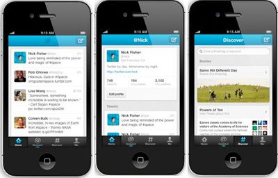
Twitter 4.0 is available for iPhone, free on the App Store [Direct Link]. An updated iPad app will be coming down the road.














Top Rated Comments
They're probably just spam accounts anyways.
Guess it takes a while - looks great the new design though from the pictures.
Strongly recommended!
To get back to the front of your timeline, just tap the home tab (even if you're already on the home tab)