Thomas Park has put together an interesting gallery of storefront photos from all 357 of Apple's retail stores around the world. While the photos are simply pulled from the individual retail store pages on Apple's site, the gallery format ordered by date of opening makes for easy browsing and examination of the evolution of Apple's store designs. Some of the stores have of course been renovated over the years, but many of the early stores still retain their original exterior appearance.
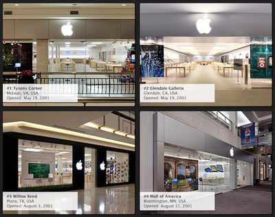
As Park notes in a blog post about the project, Apple's store designs have in fact come a long way in the ten years since the Tysons Corner and Glendale Galleria stores launched Apple's retail initiative.
At the time, most analysts considered Apple’s fledgling retail initiative to be doomed. But though Tysons Corner seemed like a modest start, it was a blueprint for big things to come. 357 stores and counting later, Apple is tops in sales per square foot, and they did it by applying many of the same principles as they do to their products: natural materials, understated aesthetics, and daringly innovative processes.
Anyway, one thing I wanted to do was go back and see how Apple storefronts have evolved over the past decade. I couldn’t find anywhere to do this easily, so I decided to create a gallery myself.
All 357 images are displayed on a single page, although users can filter by country to show only those stores located in each of the eleven countries where Apple operates retail stores.
Of the 357 total retail stores, six are currently without storefront images. Five of those stores (Soho, Somerset, Pasadena, Knox Street, and Ala Moana) are currently being renovated and/or expanded, with Apple operating temporary stores nearby during construction. The sixth store, Victoria Gardens in Rancho Cucamonga, California, recently moved to a new location within the shopping center and the store page has yet to be updated with an image of the new store.
















Top Rated Comments
It's not the data the picture was taking. It's when the store opened. The pictures could have been taken at any time
And in fact, 3 of those 4 have been heavily remodeled in the decade since they opened. All four would have looked like the Willow Bend store, with the black pillars and the Apple logos on each side of the door.
Let's see if you can parse out your mistake...
Started with double black pillars.
Then, aluminum.
Now, full glass.
The Regent Street Apple Store looks amazing.